The standard rectangle shape is preferred for UI icons versus other geometric or oddball shapes.
In smart home control user interface design, a pushbutton icon is more than just a simple button. It’s everything. A single icon can often be the centerpiece for controlling light, intrusion security, surveillance cameras, audio, video, motorized shades and more. If that icon is unattractive and poorly designed, it can lead to dissatisfaction with the entire control solution, not to mention damage the integration the company’s reputation.
Of course, most UIs today have a standardized design from the manufacturer, but on occasion integrators are still asked to design custom UIs for their clients. Sports-themed and college alumni themes are anecdotally common.
But is there an art to designing the perfect touchpanel icon pushbutton? Yes, according to a new book “Designing Interfaces” by Michael Malewicz, a designer with over 20 years of experience in building digital products.
In the book, Malewicz specifically digs into the importance of user interface design, particular with action-oriented buttons. The primary focus of the book is related to ecommerce websites for online retailers, where the user interface design of that “save” or “purchase” pushbutton can make or break a company. For integrators, many of the same principles apply for the design of their clients’ smart home control systems’ touchpanels and on-screen displays.
7 UI Mistakes to Avoid
Mistake #1: Making a Pushbutton Not Look Like a Pushbutton

“Digital buttons are also descendants from real-world buttons, like on a TV remote, record player, or game controller,” says Malewicz. “The most important thing to know is a button should look like a button, and the most important rule for designing a button is to make it stand out enough so it won’t be confused with anything else. By removing elements from a button its function starts to dissolve and disappear. It becomes decoration or text, losing its actionable qualities.”
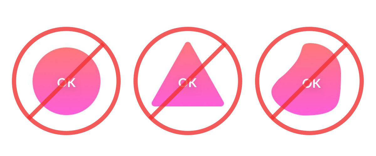
Mistake #2: Using Odd-Shaped Icons
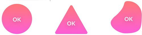
“We are used to certain shapes and forms that are normally associated with an action,” says Malewicz. “The more our button looks similar to what we associate with buttons, the better.”
Because of this rule, he says a rectangle (or a rounded rectangle) is always the safest choice for a pushbutton because it is immediately identifiable as an action-inducing button compared to other shapes such as triangles or circles. He advises only using those shapes when the style requires such deviation. According to Malewicz, any element that forces the user to take more time to determine what the button is for, will inhibit the action.
Mistake #3: Ignoring the ‘Safe Space’ & ‘Padding’ Ratios
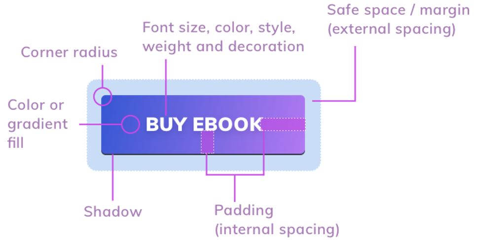
Of course, the spacing between the icons, dubbed “safe space,” on a touchpanel is important. Too close together doesn’t look appealing. But Malewicz also says the spacing of the terms inside the button itself is important, called “padding.”
The action term (i.e., “TV” “Music” “Lights”) should be evenly spaced within the button itself. He says there is an advisable ratio between the vertical and horizontal padding inside the button. The spacing to the left or right of the word inside the button should be 2X the space on the top or bottom. Also, the terms should always be centered inside the button.
Mistake #4: Making Buttons Too Big or Too Small
Just like Goldilocks, your UI icons can’t be too big or too small, but “just right.” But in general, larger is better.
“Both web and mobile buttons should also have the right minimum size. If your buttons are too small, it will be difficult to tap or click on them. The best way is to start with 44 x 44 pixels for all interactive elements on mobile devices,” advises Malewicz. “The sweet spot is somewhere around 50 pixels for mobile buttons. In the case of cursor-based devices, 32x 32 pixels should also work.”
Mistake #5: Not Using Icons for Important Buttons
‘Important buttons also work well with icons,” says Malewicz. For example, including the icon for a TV, along with the term “TV” is a good idea. Similarly for other important functions like “Security,” “Lights,” or “Shades.”
Mistake #6: Not Using Shadows

“Buttons with shadows are also more ‘clickable’ and noticed much faster than flat ones,” says Malewicz. “Add a subtle drop shadow in the button to make it stand out from the background more.”
Mistake #7: Rounding the Corners Too Much
Malewicz says rounded corners are considered more desirable in general, but if you round the much, it is less appealing, especially if you are aligning buttons vertically on the touchpanel or on-screen display.
“If you have left-aligned text just above the button, the more rounded the corner the less that text will visually fit — it’ll make you feel as if the left margin is in two places at the same time,” he adds. “When you start building out your primary, secondary, and tertiary buttons, try to remember to check them against a couple of factors every time.”
"interface" - Google News
October 13, 2020 at 02:44AM
https://ift.tt/3nMmtRm
7 Mistakes to Avoid in User Interface Design - CEPRO - CEPro
"interface" - Google News
https://ift.tt/2z6joXy
https://ift.tt/2KUD1V2
Bagikan Berita Ini


0 Response to "7 Mistakes to Avoid in User Interface Design - CEPRO - CEPro"
Post a Comment