For the first time in Zwift’s history, they held what would be akin to a product launch event, detailing their upcoming product plans. Albeit, one that was given in private to the media rather than publicly. But nonetheless, the resultant details remain the same for you – just instead saving you approximately 58 minutes on a Zoom call, you’ll spend 32 minutes reading this post.
Ultimately, the main changes that are coming boil down into three buckets:
1) Overhaul of user interface (menus) open launching Zwift: This makes it far easier to pick what you want to do on Zwift, especially if you don’t have a concrete plan (e.g. choosing an upcoming group ride, free riding a route, having route badges tracked, etc…)
2) Public launch of Clubs: This will allow self-serve creation and management of clubs that doesn’t involve Zwift HQ being involved in the process. This includes setting up and planning large scale group rides, and much more.
3) The launch of a new map called ‘Neokyo’, which is a Neon Tokyo of sorts: This is part of the Makuri Islands World. So one can argue if it’s just new roads or a new map, but in this context it’s hard to say it’s just an expansion, as it’s clearly far more than that.
Beyond those items, Zwift detailed approximately 2,392 different stats on how you use Zwift. In short, they know where you sleep at night, and which nights you’re likely to Zwift (because, it is a night – Tuesday night specifically – except the 5AM crew, but mostly weeknights between 6-8PM local time zones). They also know that if you Zwift with an event you’ll Zwift more than solo (15-30% longer), and that if you ate a Chipotle burrito immediately beforehand, the ride will likely go poorly (general life observation). And that if you’re a morning Zwifter person, you’re 20% more likely to actually get the ride done, versus fall off the boat. These stats were somewhat like Strava’s annual Year in Review stats, except just not at the end of the year.
New Neokyo Map:
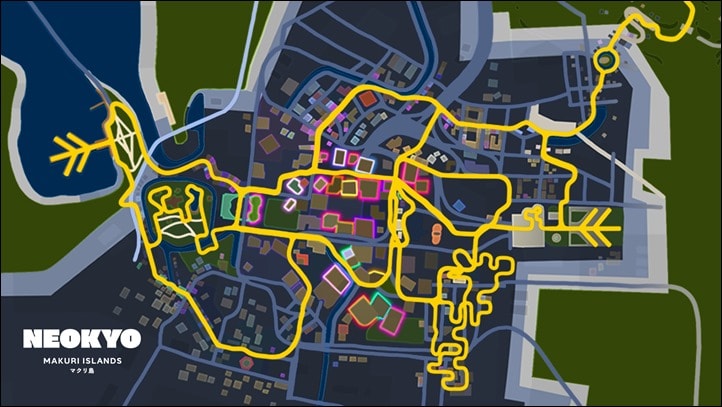
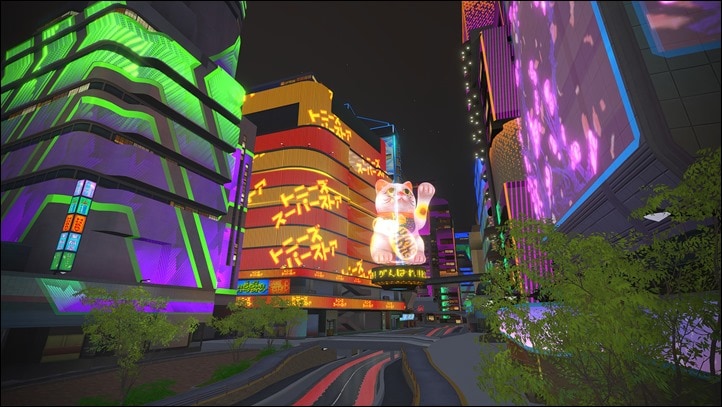
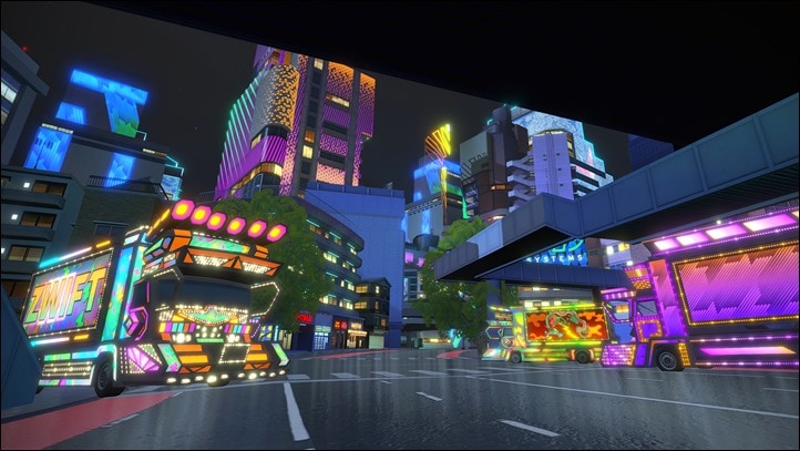
Coming in November, Zwift will be rolling out a new Neokyo map, as an expansion to the Makuri Islands (which houses Yumezi). As a reminder, Zwift first launched that world back in May, and at the time noted that it would eventually become Zwift’s rival to Watopia in size. Thus, Neokyo is connected to Yumezi, and you can ride between the two map areas since they are part of the same world. Albeit, they are dramatically different in look. The existing Yumezi is country-side Japan, while Neokyo is a neon-laden take on Tokyo.
The new addition will nearly double the amount of pavement within the map. At present, Yumezi is about 27.6km/17.1mi of roadway, so this will be slightly smaller than that in size. Unlike Yumezi, which includes some climbing, Zwift says this is predominantly a “flat and fast” set of roadway.
While they showed a trailer during the media event, they haven’t made that trailer available for distribution. Albeit, it’s basically just the below screenshot, except three minutes long and had more details including food trucks and dance parties.
Plus this one too, the only two screenshots released:
They said that upon launch of the new map section in November, that they’ll have a Neokyo Tour, similar to what they’ve done with past map expansions/new maps, in order to get your ride on.
New User Interface:
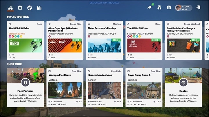
Next up is the new home screen interface. This of course has been long requested, with the main Zwift screen upon logging in having stayed the same since pretty much the beginning (minus the smallest of tweaks). But now things are dramatically different – and clearly focused on getting you exploring more of Zwift, rather than just doing the same thing every time.
Zwift noted that basically, people fall into three core buckets when they ride Zwift:
A) Train: Either doing a structured or group workout, or a training plan
B) Compete: Doing a race or series of races
C) Explore: Group rides/runs, free rides/runs, badge hunting, and tours
Within those three buckets, Zwift says that:
– 50% of Zwifters fall into the ‘Train’ bucket at least once each month
– 20% of Zwifters will ‘Compete’ in an event at least once a month
– 80% of Zwifters will do something in the ‘Explore’ bucket at least once a month
Semi-related to all of that, and with no particular place for me to stash it, I’ll note that Zwift says that starting in November they’re going to be running a new race series that’ll add far more races to the daily calendar – somewhat like the ZHQ races, but with more availability when you log into the game.
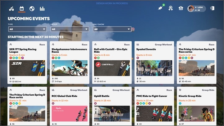
In any event, back to this user interface. This new UI is designed to broaden your buckets by showing you more options of things that are going on. If you’ve signed up for group rides or races, it’ll show what those are, extending out into future weeks. Meanwhile, the Just Ride section will show routes, and estimated times for each route. You can see above that there’s the Pace Partners option too, though unfortunately those still (somewhat inexplicably) remain on Watopia only. Frankly, I think they’re one of the best things to come to Zwift since launch, yet they become boringly stale when they’re only Watopia, and largely just the same set of four routes.
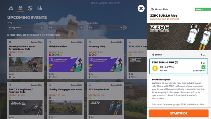
If you tap on the events tab/button, you’ll see all the upcoming events, and can apply various filters including the type of event (e.g. Group Ride, Group Workout, Race, Fondo, Time Trial), and Group (e.g. A/B/C/D). The ‘only show’ filter allows things like only showing Zwift Academy events.
So referring to the above, let’s say that you click on an event, you’ll get details of that event shown in a side pop-over:
If you’re good with that, there’s a quick access menu from the main home screen to change your jersey, as well as access sensor pairings. Though, those screens in the presentation appeared identical to before.
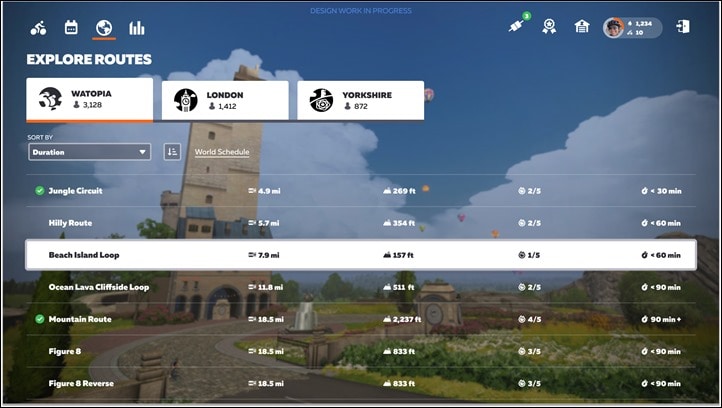
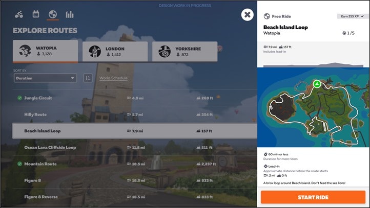
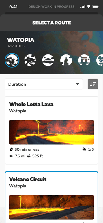
Next, there’s a new routes finder user interface. Once you click on the globe icon, you’ll see the worlds currently live listed at the top, and then the routes down below. This new page shows which routes you’ve completed, and then the distances and elevation for each one.
You can filter/sort these by various metrics including Duration, Name, Effort, Distance, Elevation, and Route completion. Once you click on a route, it’ll show you the route profile, and how many XP you’ll earn. You’ll also notice back on the earlier screen (above), it’ll display an estimated completion time. Zwift says this is based on the estimated completion time it takes 80% of Zwifters to complete it in (max time). The point being you can basically say ‘Look, I’ve got 45 mins for this workout, what’ll fit?’.
Zwift noted that while many of us, including probably most readers of this site, will easily be able to do mental math on elevation & distance combos to figure out durations – that most newer riders won’t have that experience. So this makes it easier to find routes in the same way you ultimately filter structured workouts based on time.
Speaking of routes and such. For lack of anywhere else to stick this tidbit – the Tour de Zwift will start January 10th, 2022. And the Tour of Watopia will be held in March.
As for this user interface overhaul? Frankly – that’s the fuzziest thing Zwift detailed. During different parts of the media presentation and follow-up e-mails they gave three different timelines. However, the latest and most semi-consistent answer seemed to be that it’ll start rolling out in a phased launch later this year, but wouldn’t achieve full roll-out till “early 2022”.
Either way, it’s much needed – and based on everything I saw, this definitely makes it more likely that I’d crack open Zwift on days where I didn’t have a clue as to what I wanted to do. Since it made it far easier to quickly filter to find a ride that meets my time and interest requirements. As long as it ends up working that way in real life, I suspect it’ll be a hit (even if it doesn’t quite please every aspect of the community).
Oh – one more thing: They specifically noted that they’re aiming to make this new user interface suck less on Apple TV.
Clubs Expansion:
Finally, there’s the Clubs expansion. Clubs started nearly two years ago in beta, and Zwift says they’re finally to the point of being able to expand it a bit more – ultimately getting it opened up to everyone – ideally by “early 2022”.
Clubs allow you to invite people to a club, and then have club-only events, which are held in private worlds, so only those team members are present in the event. There are also ancillary benefits of having stat tracking and such. But ultimately, this is all about having team events. However, up till now only the biggest and most well connected to Zwift HQ clubs could get an actual club made on Zwift. Thus, your average cycling team or triathlon team or whatever else, couldn’t.
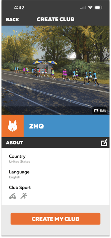
Starting later this year, you’ll be able to. First up, to create a club you’ll give it a name, language, and choose the team colors. You’ll also choose the team icon and club image. The icon appeared to pull from a pile of predefined icons. They didn’t detail how you can select the club image.
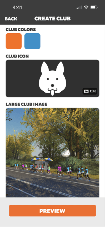
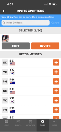
Next, from there you can invite other Zwifters to join the club. Once the invite is sent, the person on the receiving side can choose to accept (join) or decline the invite. Once joined, you can see the upcoming club events, as well as club chat. Further, there are total club stats displayed too (just as there already is).
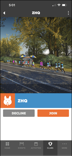
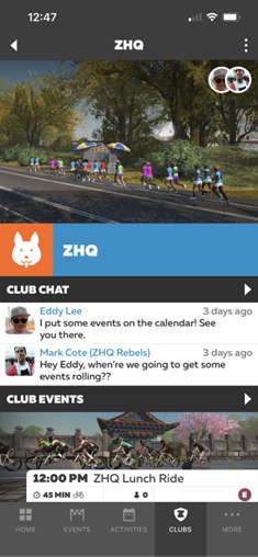
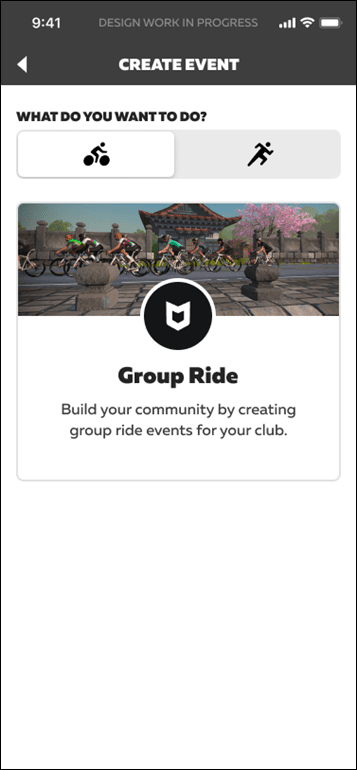
However, the main magic is the ability to create a club event. To begin, you’ll start with whether it’s a run or a ride. Then from there, you’ll be presented some quick-start templates from different groupings – like flat routes, or hilly routes.
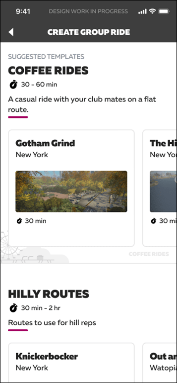
If the templates aren’t your style, you can choose which world you want from the list, and then dive into choosing the exact route you want. You can further customize that to be a set number of laps or a given time duration as well. Afterward, you’ll give it a title, and the time of the event. Also a description, and then adding which groups will be available for that ride.
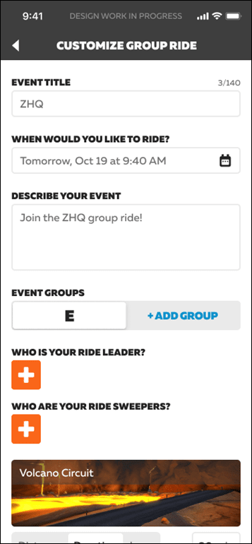
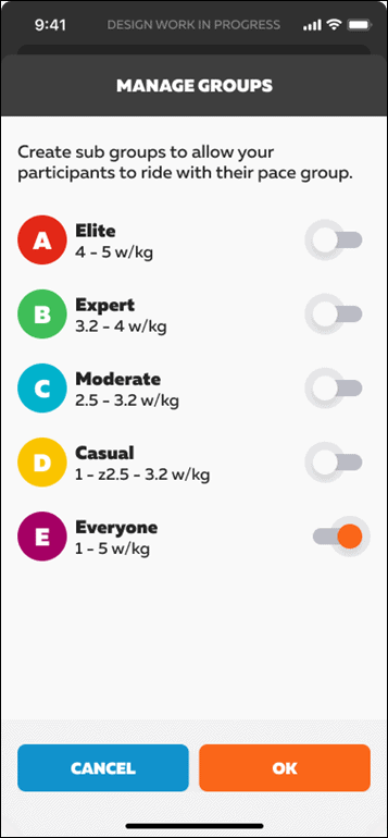
However, this is where it gets interesting. You can even customize different routes for different groups. So for example the A group could do one route for this event, while the C group does a different route. Further, you can then set a ride leader and sweeper for each group as well. You can also set those later, if you don’t have them sorted at event creation.
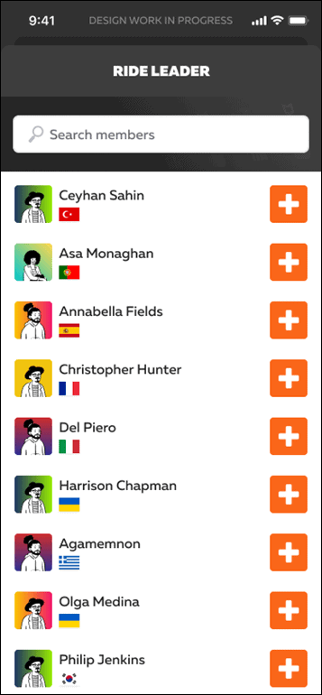
Once all this is done, it’ll be available to those in the Club.
In terms of availability, this will roll out in limited release before year-end with the full widespread release in early 2022. To create a club you’ll need to be either a Level 20+ Rider, or a Level 10+ Runner. However, anyone can join a club. Club events can be shared with anyone, including via a simple shareable URL (woot!), allowing someone from outside the club to join the event.
Zwift says the next developments are to roll out Club structured workouts (right now you can only choose routes, not workouts), and then to put together an interface for discovering clubs to join.
Wrap-Up:
As with any new release plan – there will be some that’ll be excited for the upcoming changes, and some that’ll be disappointed and asking for more. It’s too soon to say whether or not Neokyo will be what Zwifters want in terms of new roadway. However, it’s definitely clear that Zwifters are looking for a new user interface. And based on what I’ve seen thus far – this seems to be a good start at things.
On the Clubs side, this seems mostly well thought out, but that doesn’t excuse the fact that this took two years, and nearly 1.5 years since it entered public beta. They missed the boat on literally countless teams that wanted to use Zwift to organize events during lockdowns. That didn’t happen. Similarly, there doesn’t appear to be any obvious way for getting team jerseys in-game, another strong request for teams. Zwift largely ended that program more than two years ago now, without any clear path forward. Again, there’s just no excuse for not having this functionality. Plenty of other online game platforms have solved this customization problem (including approval) at scales far larger than Zwift. Having a team kit is kinda sorta like starting point one for having a team in real life.
Still, despite my frustration at how painfully slow Clubs is going, I’m optimistic that maybe the winds of change are starting to pick up speed at Zwift and getting some of these things moving forward. New pavement is always a welcome addition, and while new user interfaces can go both ways, everything Zwift is showing at this point is a vast improvement over where they are today and seems to be headed in the right direction of making things more discoverable. Which ultimately, keeps people on Zwift longer – and ideally, doing new and different things.
With that – thanks for reading!
"interface" - Google News
October 20, 2021 at 04:00PM
https://ift.tt/3C0ClpV
Zwift Details Plans for New Neokyo Map, New User Interface, and Clubs Public Launch - DC Rainmaker
"interface" - Google News
https://ift.tt/2z6joXy
https://ift.tt/2KUD1V2
Bagikan Berita Ini




0 Response to "Zwift Details Plans for New Neokyo Map, New User Interface, and Clubs Public Launch - DC Rainmaker"
Post a Comment