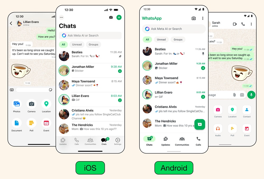
Meta has unveiled a series of updates for WhatsApp, aiming to give the platform a fresh, approachable, and simple look. These changes mark the first major overhaul since 2021.
Meta says their team kept three guiding principles in mind during the redesign process:
- Fresh: WhatsApp should feel new and enjoyable, with a look that suits your device.
- Approachable: WhatsApp should be easy for everyone to use, with a friendly and familiar feel.
- Simple: The design should be straightforward, adaptable, and ready for the future.
New Color Palette
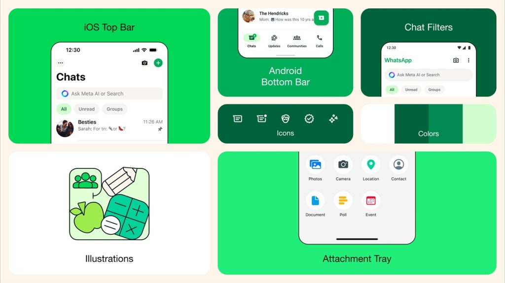
WhatsApp now sports a new green palette for a more consistent visual experience. After considering over 35 color options, Meta settled on a palette that complements WhatsApp’s iconic green while allowing for harmonious color combinations.
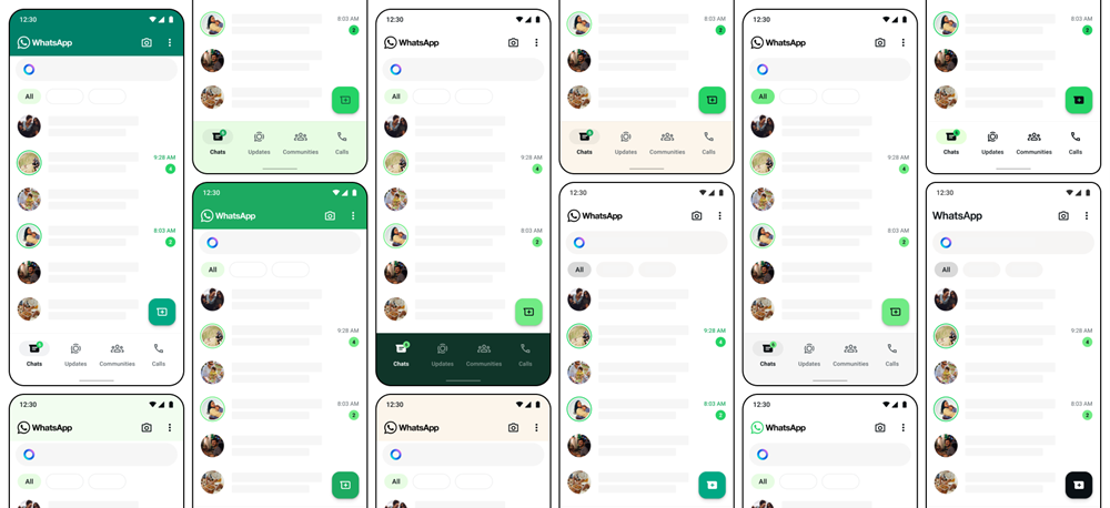
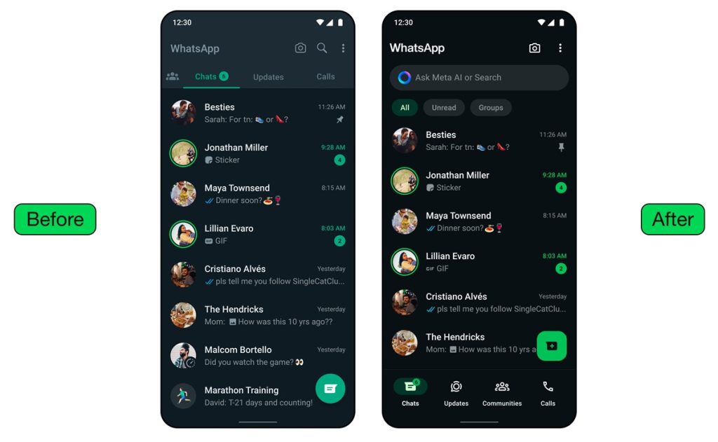
They’ve also integrated more neutral colors for added flexibility. Additionally, a darker dark mode has been introduced, featuring higher contrast and deeper tones to reduce eye strain in low-light conditions.
Updated Icons and Illustrations
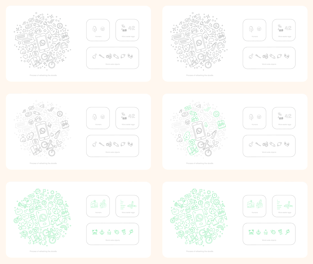
- Icons have been revamped with a rounded, outlined style to match the new look. Illustrations have also been refreshed, with added animation for a playful touch.

- Chat backgrounds have undergone a makeover as well, with simpler designs that better represent diversity.
Easier Navigation
On Android, a modern bottom navigation bar has been introduced for quicker access to features.
- Tabs are now positioned closer to the user’s thumb, offering a more intuitive navigation experience.
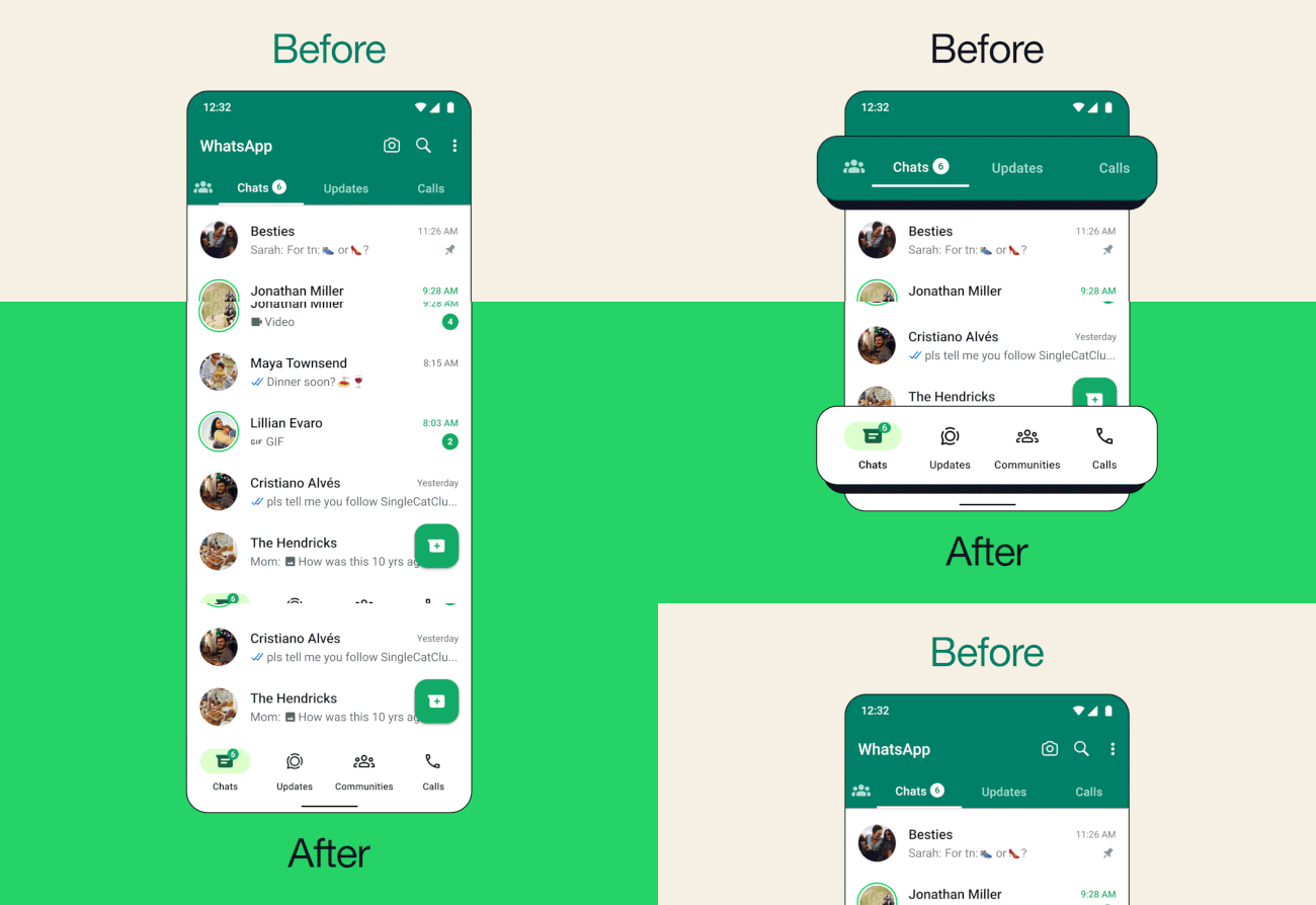
- Coming soon to iOS, users benefit from a new attachment layout, making it easier to send media, polls, documents, and more.

Improved Chat Management
Building on the recent introduction of chat filters, WhatsApp now enables users to focus on important conversations more efficiently.
- With the navigation bar relocated to the bottom on Android, chat filters are conveniently placed at the top of the chats list.
- Users can easily switch between unread and group filters to catch up on messages or find favorite group chats.

Designing for the Future
Meta emphasizes the collaborative effort behind these updates, involving a multidisciplinary team of designers. They express excitement for users to explore the refreshed WhatsApp experience.
Meta remains committed to enhancing connectivity through WhatsApp, whether it’s for personal communication, business interactions, or leveraging Meta AI for various tasks, and are dedicated to introducing new features and improvements to empower users.
Announcing the updates, Idit Yaniv, VP and Head of WhatsApp Design at Meta, stated:
Our design philosophy aligns with our product principles of maintaining WhatsApp’s simplicity, reliability, and privacy. We filter these principles through a design lens to create intuitive and clear flows that universally facilitate connections while safeguarding privacy.
We closely observe how people interact with their devices, ensuring our user interface complements their existing experiences, thereby making WhatsApp feel familiar and effortless to navigate. If you’re familiar with using your device, using WhatsApp should be a easy.
"interface" - Google News
May 10, 2024 at 12:22PM
https://ift.tt/8ZgOrpQ
WhatsApp gets revamped interface, new colors, icons, and better dark mode - FoneArena
"interface" - Google News
https://ift.tt/4uQrmq9
https://ift.tt/g2SvhAU
Bagikan Berita Ini


0 Response to "WhatsApp gets revamped interface, new colors, icons, and better dark mode - FoneArena"
Post a Comment