Four generations of consoles with up to nine updates in the design of your dashboard.

Microsoft has not been in the console market as long as Nintendo and Sony, but there are already seven menus that their platforms have offered us, with updates that have completely remodeled their aesthetics. An unequivocal sign of how hard the American giant works when it comes to improve through updates each and every one of its services. The interface that any Xbox One owner can currently see is the one they will find in a few days on Xbox Series X.
Of course, to get here it has been necessary to evolve, and since everything has an origin we have decided to give a review of the evolution of the menus of Xbox consoles. From the original from 2002 to the new and imminent generation. From that dashboard full of transparencies to the current fluid interface, passing through the unmistakable avatars that came with Xbox 360. If it is a topic that you are passionate about, we recently also published the topic dedicated to the evolution of the interface of PlayStation consoles. Also, our colleague Alejandro Pascual reviewed the differences between the Xbox and PlayStation interfaces in this start of the new generation.
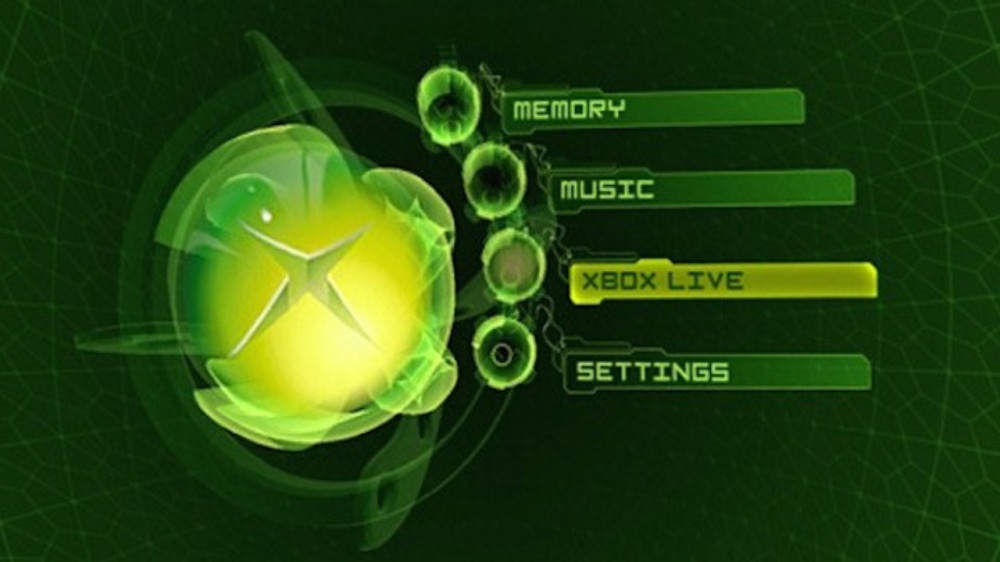
Xbox (2001) It has rained a lot since 2001, and the menu of the first Xbox was in line with what we saw at the time. Simple, with a very striking visual appearance and with hardly any customization options.
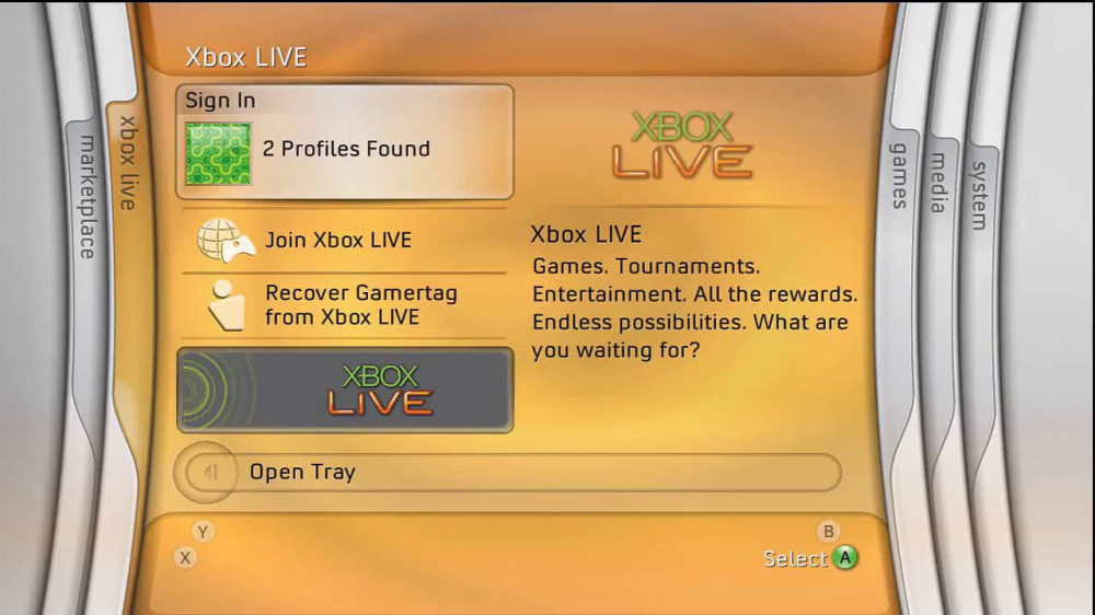
Xbox 360 (2005) The initial interface of the successful Xbox 360 divided users, as its tab-based design did not convince everyone. Each of them offered a different color: purple, orange, green, blue and red.
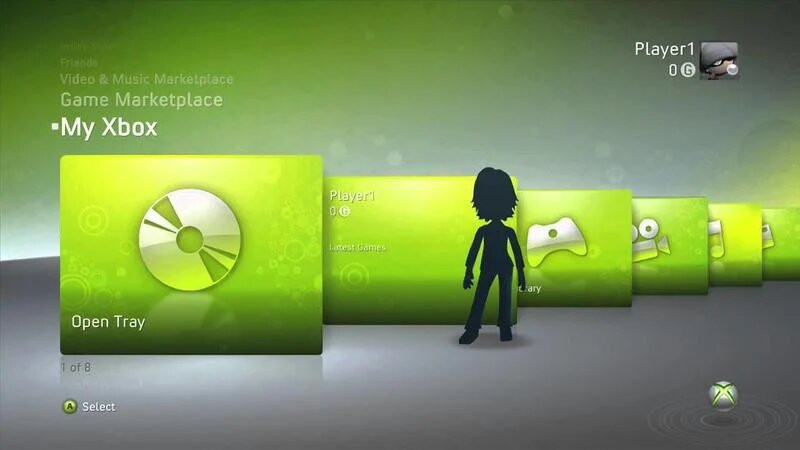
Xbox 360 – 2nd version Probably the first major Xbox 360 update brought with it one of the best menus we’ve seen on a Microsoft console: elegant, well-ordered, and very intuitive to navigate.
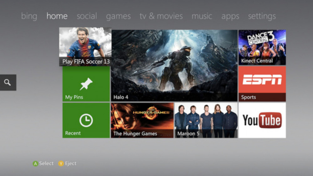
Xbox 360 – 3rd version The metro version of Xbox 360 arrived in 2011, when the generation began to head towards its final stretch to make way for the next. Its design was quite elegant, although not as functional as the previous one.
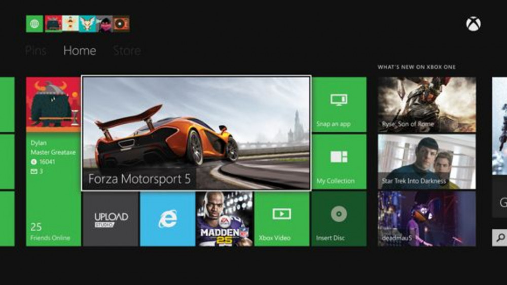
Xbox One (2013) The menu with which we released Xbox One was the logical evolution of the Metro version of Xbox 360. Its design maintained a similar visual line with that of Windows 8, Microsoft’s operating system at that time.
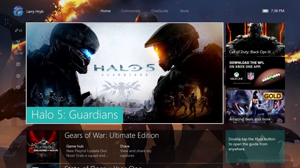
Xbox One – 2nd version Microsoft wanted to give a twist to the initial dashboard of its console, but the truth is that it was not successful, since its new version was somewhat cumbersome and not too fluid. It is not the favorite interface of Xbox fans.
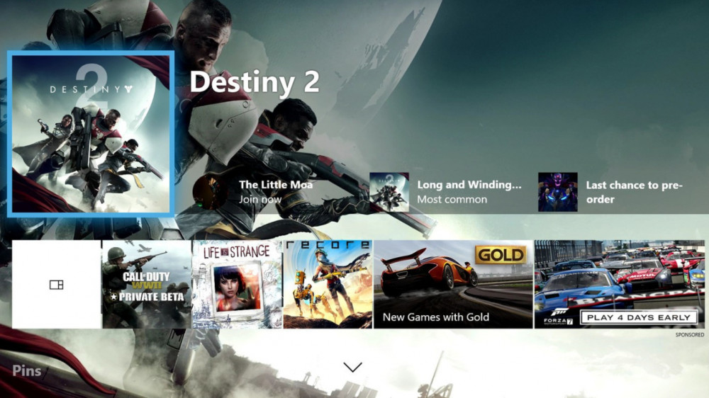
Xbox One – 3rd version The third version of the Xbox One interface was very popular with users, as it substantially improved the fluidity of its predecessor and had a very striking appearance that facilitated navigation between its elements.
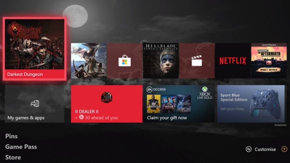
Xbox One – 4th version It is the menu that we had until just a few days ago. In fact, some users who have not yet obtained the new version continue to use it. It is very complete in terms of customization, but a bit chaotic.
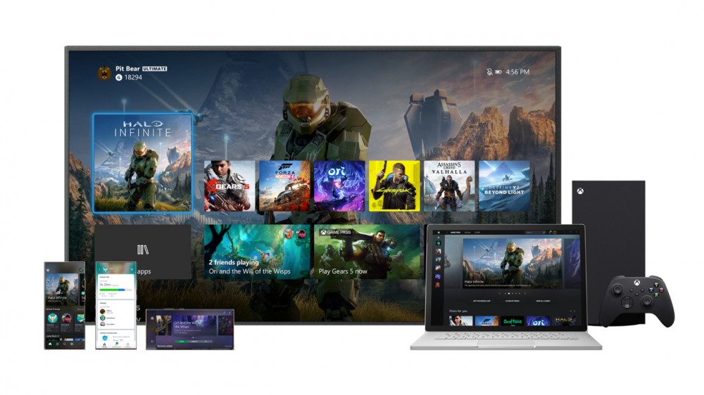
Xbox Series X (2020) and Xbox One The new Xbox Series X menu renews its visual appearance and arranges all the elements better. It is shared between the new generation consoles and those of the current cycle.
More about: The Medium, Microsoft, Xbox, Xbox 360, Xbox Series S, Xbox Series X, Halo Infinite, and Yakuza: Like a Dragon.
"interface" - Google News
November 04, 2020 at 08:06PM
https://ift.tt/34XKEVi
Gaming : This is how the interface of Xbox consoles has evolved, from the original to Xbox Series X and S - Explica
"interface" - Google News
https://ift.tt/2z6joXy
https://ift.tt/2KUD1V2
Bagikan Berita Ini


0 Response to "Gaming : This is how the interface of Xbox consoles has evolved, from the original to Xbox Series X and S - Explica"
Post a Comment