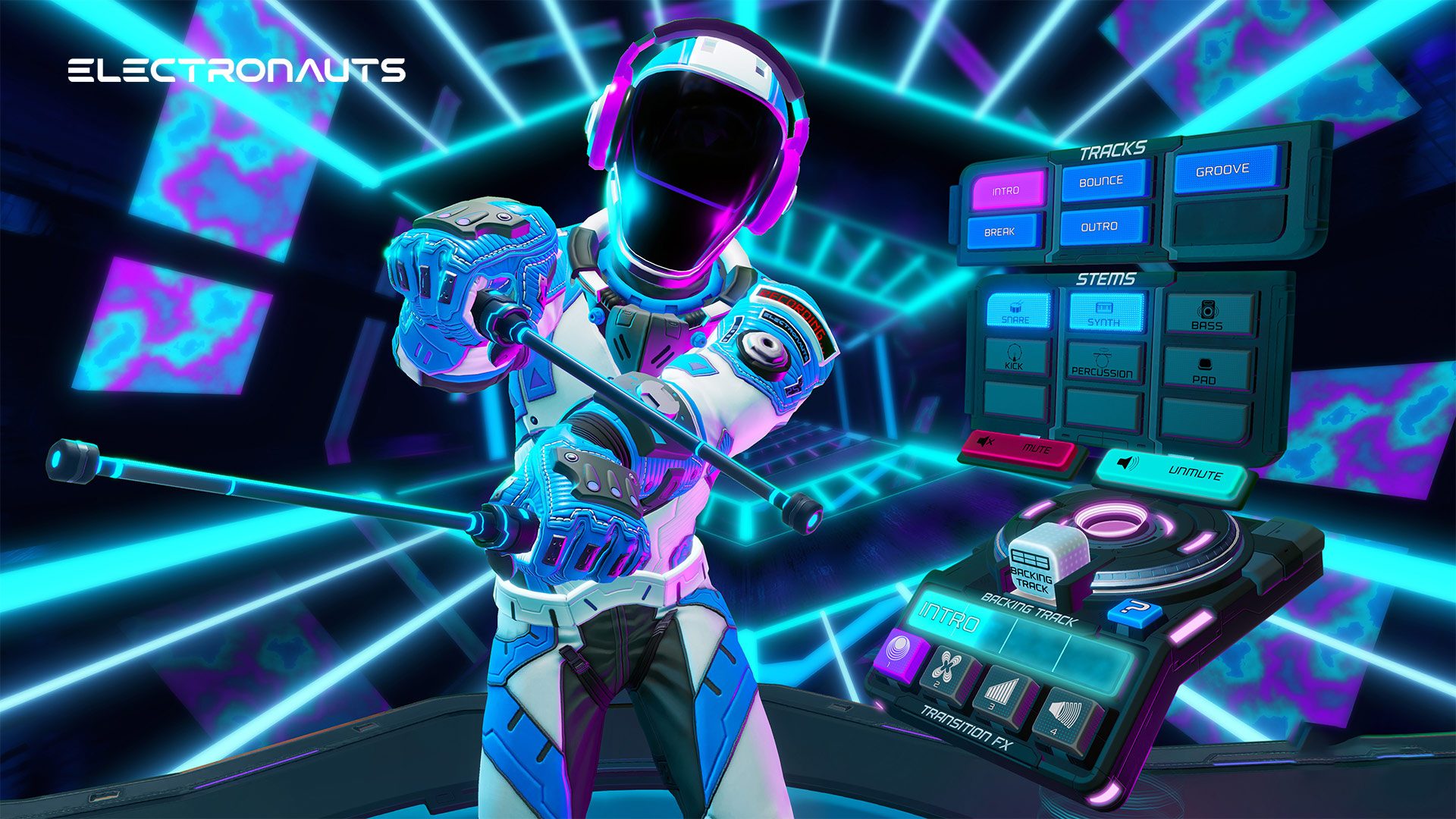
Inside VR Design is a pilot for what could become an ongoing series examining specific examples of great VR design. Today we’re looking at the interface of Electronauts to find out what makes it so excellently usable.
You can find the complete video below, or continue reading for an adapted text version.
Electronauts is a music making game by developer Survivors that’s designed to make it easy to feel like a competent DJ, even if—like me—you don’t have much musical talent. It’s available on every major VR headset; check out our full review here.
And while it’s easy to think that the game’s interface has little relevant outside of music, nothing could be further from the truth. The Electronauts interface is smartly designed at the core, and for reasons that have nothing to do with music.
There’s three pillars to this interface that make it great: ease-of-use, hierarchy, and flexibility.
Ease-of-use
It’s clear to see why the designers would give the players drumsticks for a game with drum-like instruments, but what’s really smart is also making the drumsticks the tools for manipulating the interface. Humans are evolutionarily adept at manipulating tools—in fact studies have shown that with enough practice, we subconsciously and proprioceptively consider tools to be an extension of ourselves.
In the case of Electronauts, the extra reach provided by the drumsticks allows the interface to be comfortably large to overcome issues with precision, making the entire interface easier to use with less chance for mistakes.
We can see this clearly in the way that the game’s buttons work. While the intuitive idea would be to have buttons that are pressed when touched, Electronauts does things differently for the sake of precision. Instead of simply touching a button to activate it, you actually insert your drumstick into the button and then pull the trigger.
This is a very smart solution to the issue of missing physical feedback in VR. Real life buttons are deeply designed around physical feedback, and this feedback helps you press them reliably. Because there’s nothing to push back on the drumstick in VR, it’s harder to confidently target and activate a physically simulated button.
Asking the user to intersect the button with their drumstick and then pull the trigger to confirm their selection greatly increases the precision of the game’s buttons compared to a physical button simulation.
Hierarchy
Hierarchy is an essential part of any interface. It’s the way in which you organize the functions of the interface so that it’s logical, easy to remember, and easy to access.
Electronauts has a very smart hierarchy where all of the game’s functions are contained within tools, and all of the tools are represented as cubes. To access the functions of any tool, you simply place a cube into a pedestal.
You can think of each cube as it’s own little mini-app, just like the way that smartphone apps are shown as icons on a screen, each containing specific functionality. This makes it really easy to remember where to access certain functions without the interface needing to overwhelm the user by displaying all the functions at once.
With a limit of three cubes active at any one time, Electronauts does a good job of having a clearly organized hierarchy that’s not too deep. A hierarchy that’s too deep—like having folders inside of folders inside of folders—can mean too much time spent digging to reach the function you’re looking for, even if it means everything is clearly organized.
Continued on Page 2: Flexibility »
"interface" - Google News
July 21, 2021 at 03:24AM
https://ift.tt/3iyKbyq
Inside VR Design: The Interface of ‘Electronauts’ - Road to VR
"interface" - Google News
https://ift.tt/2z6joXy
https://ift.tt/2KUD1V2
Bagikan Berita Ini


0 Response to "Inside VR Design: The Interface of ‘Electronauts’ - Road to VR"
Post a Comment