During Google’s I/O event last year, the company laid out plans to significantly revamp the look and feel of its Workspace cloud apps (they were called G Suite until a 2020 name change). That includes a new look for Gmail that’s starting to roll out this month, search chips (you can just call them filters) for Google Drive, and a set of changes that are about to arrive for Google Docs and Google Sheets.
The theme of this approach is called “smart canvas.” It takes some hints from productivity apps like Notion to give you more options for blending the features of multiple tools in one screen and to promote ways that you can collaborate remotely with coworkers, powered by Google’s AI. Integrating its various office apps is an approach that conveniently helps Google increase corporate lock-in to its services, which is a good enough idea that Microsoft is working in a very similar direction with Fluid framework updates in its own Office suite.

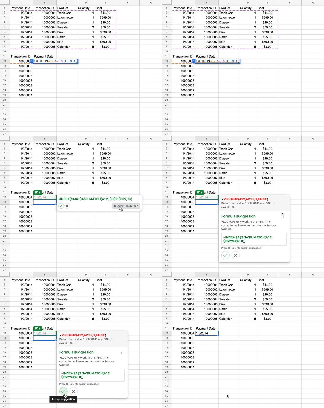
Last fall, Google added AI-generated formula suggestions that we called “autofill for math,” and now, Google says its next step is more like autocorrect. The feature is coming soon to Sheets, with promises to help users troubleshoot their formulas and catch errors.

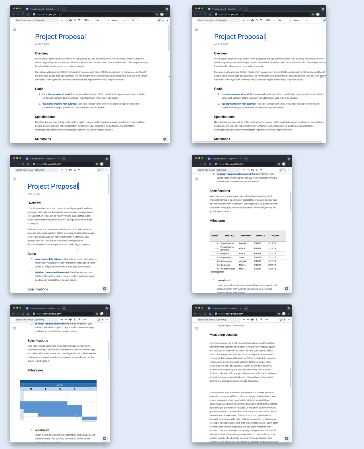
Features described during the May I/O presentation are going to be rolling out to Workspace accounts gradually over the next couple of weeks, including a pageless format for Google Docs. Instead of defaulting to a view that replicates a standard-size printed page, Google Docs content has no boundaries, which the company says will make it expand or shrink to fit whatever kind of screen you happen to be using. According to Google’s support document for the feature, “[w]hen you view a pageless document, you can select a text width of narrow, medium, or wide. You’ll see the same text width on all pageless docs that you view. Your text width choice won’t affect how collaborators see your docs.”
You can switch back to a view with page breaks if you need to print something out or convert it to a PDF, but Google’s bet is that in connected, remote workplaces, that won’t be as necessary in the future.
Instead, people will interact directly with documents that include interactive elements to surface whatever information is relevant at the moment, like embedded Google Maps links that you can click to quickly see a preview without opening another page or app. Another new feature enables Google Docs to auto-generate summaries of documents using its own intelligence to find the main points that appear in the left rail. Once it’s live on eligible Workspace accounts, just click View at the top, then Show document outline to bring up the summary.
One feature that isn’t available yet is an easy-access email draft template so that you can click one button to output all of the content into a draft in Gmail. That’s rolling out “in the coming weeks.”
"interface" - Google News
February 17, 2022 at 06:03AM
https://ift.tt/JR5lQLv
Google’s ‘smart canvas’ vision for Workspace is bringing a pageless interface to Docs - The Verge
"interface" - Google News
https://ift.tt/xu9XwZ1
https://ift.tt/Fb923ED
Bagikan Berita Ini


0 Response to "Google’s ‘smart canvas’ vision for Workspace is bringing a pageless interface to Docs - The Verge"
Post a Comment