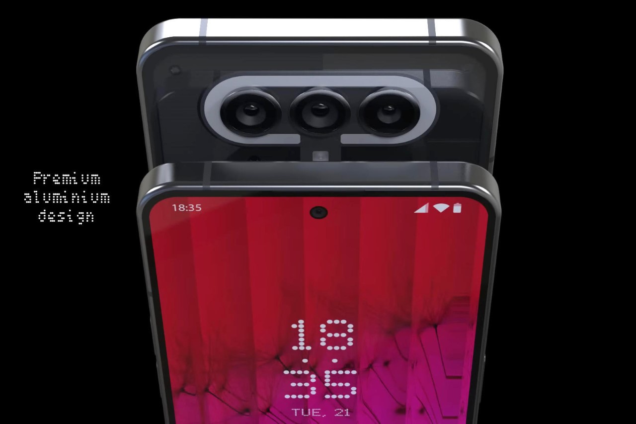
As we anticipate the launch of the Ear (2), Nothing’s 2nd gen TWS earbuds, here is a look at what we can expect from the 2nd gen smartphone which should also drop sometime this year. The Phone (2) will, for the most part, look a lot like the Phone (1), barring a few minor design tweaks and hardware upgrades. Concept designer 4RMD put together this dapper-looking handset to show us what the Phone (2) could potentially look like. The rendered concept features the same aluminum chassis with a transparent rear, a slightly modified Glyph Interface to reflect the new 3-lens camera setup, and a 6.65-inch AMOLED display on the front with thinner bezels than before and a 120Hz refresh rate and 1200nits peak brightness. As per Carl Pei’s announcement at the Mobile World Congress, the 2nd gen phone will also feature Qualcomm’s Snapdragon 8+ Gen 1 chipset.
Designer: 4RMD
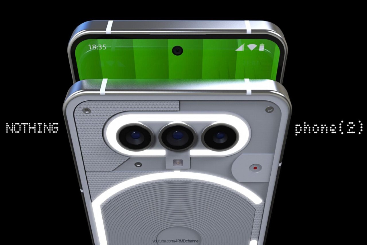
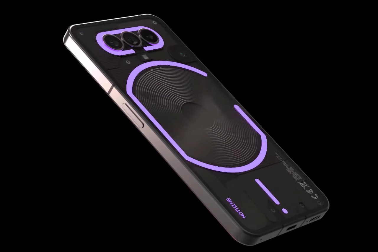
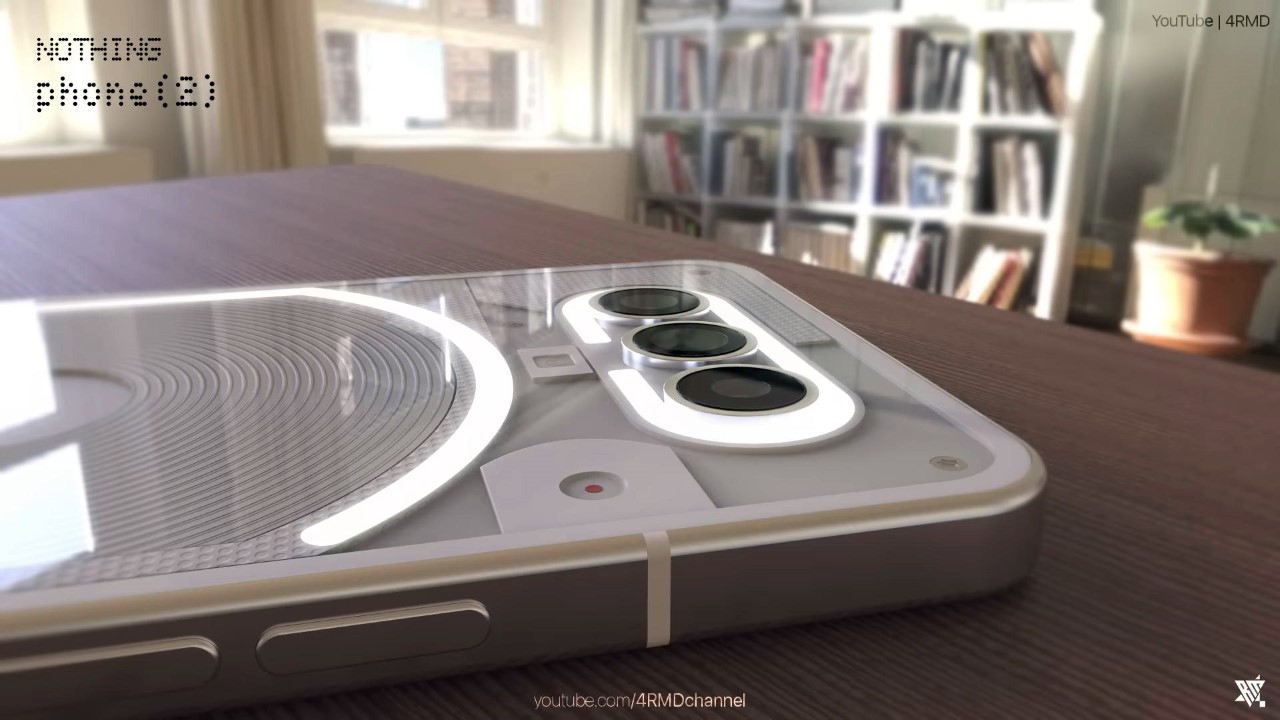
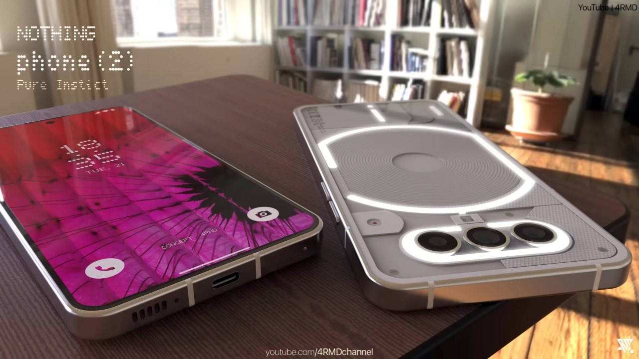
Completely refreshing a phone’s design is incredibly expensive, so chances are the Phone (2) will rely on a design not too different from the Phone (1), so it can use a lot of the same parts as a result. The new phone looks pretty much identical in terms of shape and size, while the only notable design change lies in the 3-lens camera array on the top. This also means the Glyph Interface stays the same for the most part, featuring only a minor change on the top with the removal of the ‘Antenna’ LED strip and a horizontal and slightly longer ‘Camera’ LED arc. You’ve still got the G-shaped LED strip around the wireless charging coil, and the exclamation-mark LED strip near the USB-C port.
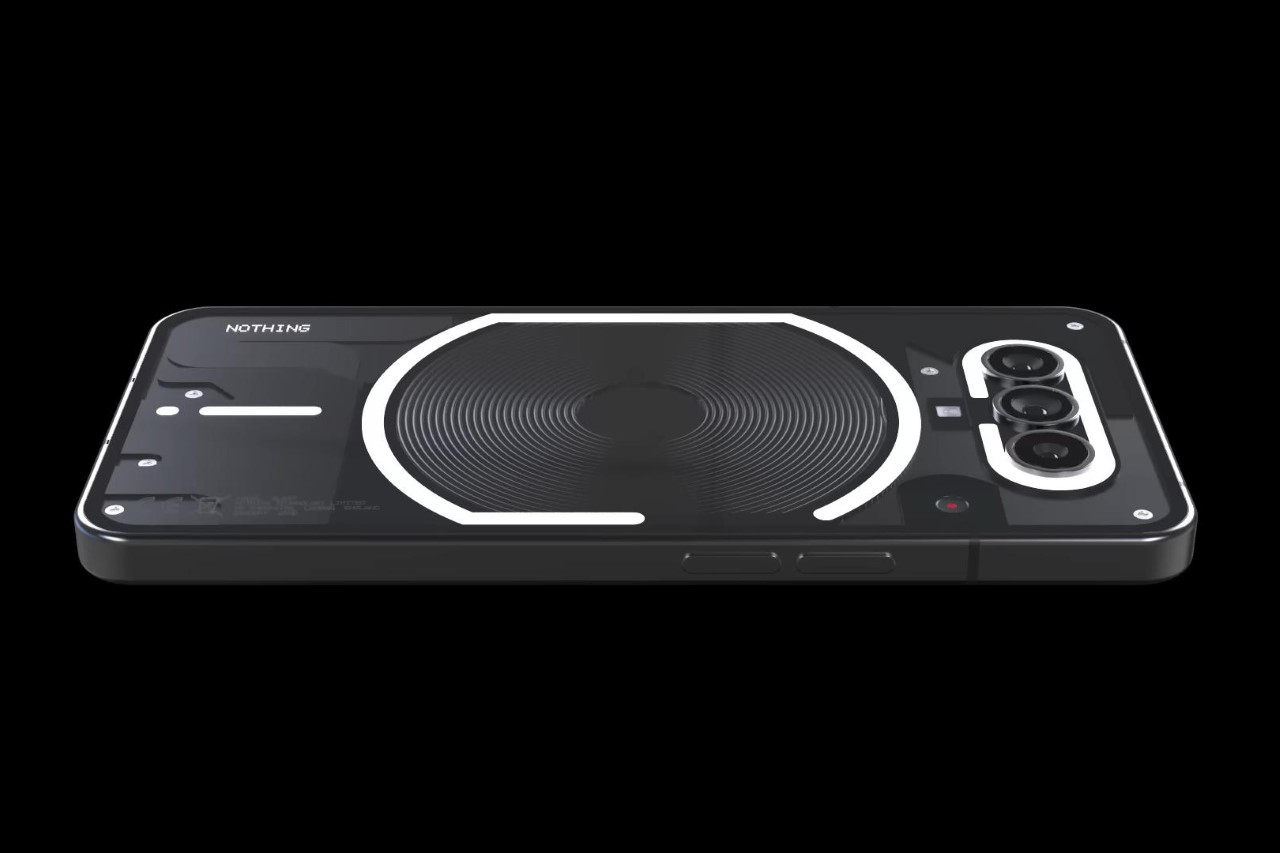
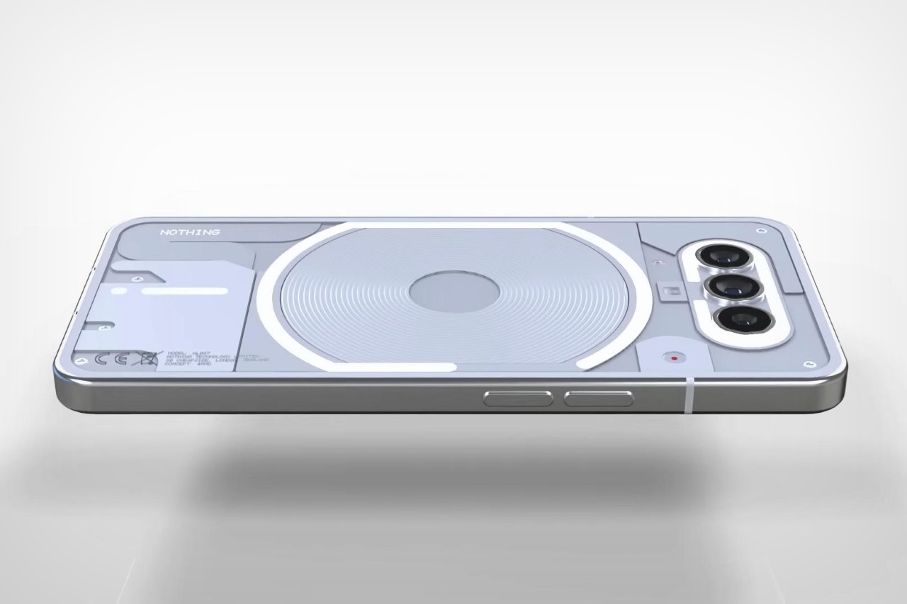
Further keeping things simple, the Phone (2) retains its predecessor’s black and white color variants, while highlighting the phone’s see-through back as a design feature. I honestly can’t get enough of how beautiful the components look through the transparent Gorilla Glass Victus panel, and it’s great to see Nothing embracing this feature moving forward.
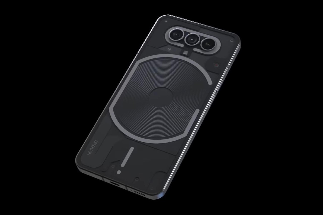
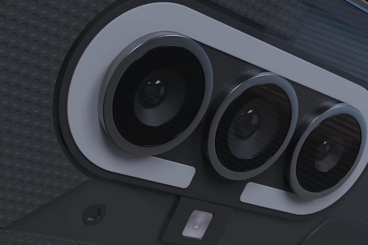
The one true visible change is the new phone’s camera layout, which now has three cameras instead of two. Arranged horizontally, the layout feels similar to the Pixel’s camera bumper, with a slight nod to the 7T, which was one of Carl Pei’s last OnePlus models before he departed the company in October 2020. The new layout features a dream team of three 50MP shooters, including one Wide, one Ultra-Wide, and one Telephoto to put the Nothing Phone (2) firmly in the camera race for 2023.
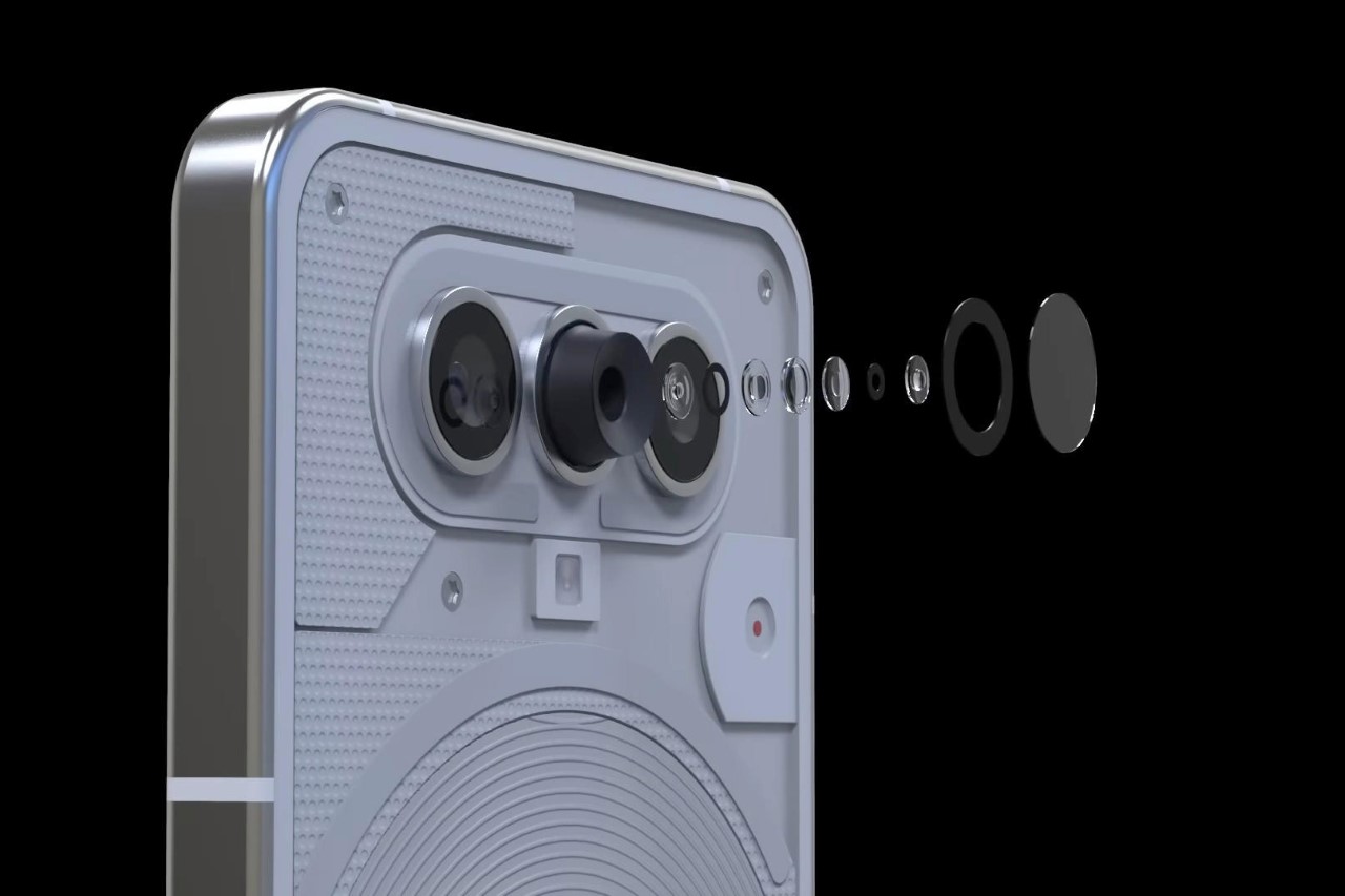
Although personally a big no-no for me, 4RMD also hid one more easter egg in his design in the form of RGB LEDs in the Glyph Interface. While I personally think the white LEDs have a lot of character for a device that small, the Phone (2) concept’s Glyph Interface can now shine in a variety of colors, blinking blue for Twitter, Pink for Instagram, Yellow for Snapchat, Red for YouTube, Green for Phone Calls, and a host of other colors depending on the app or type of notification.
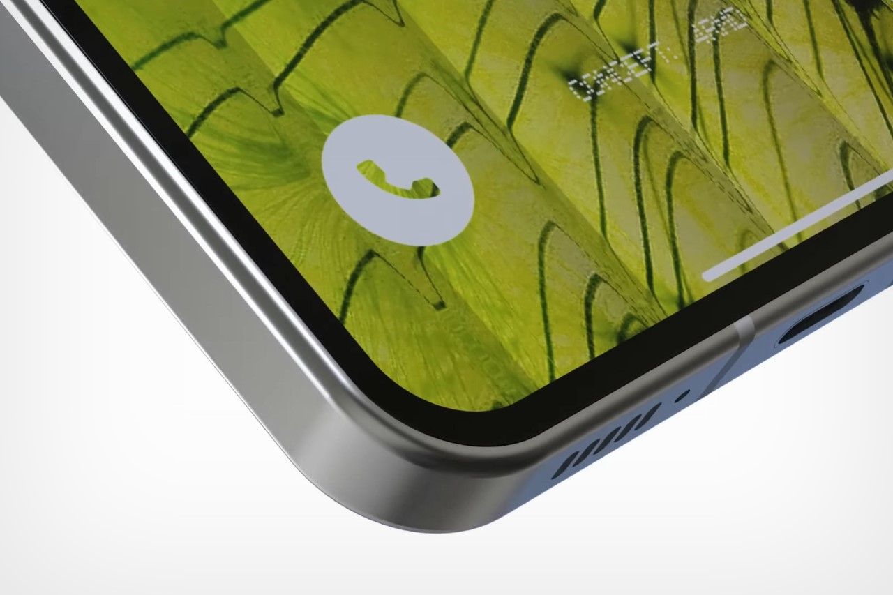
The same AMOLED display and flat-edge Aluminum chassis, but with thinner bezels.
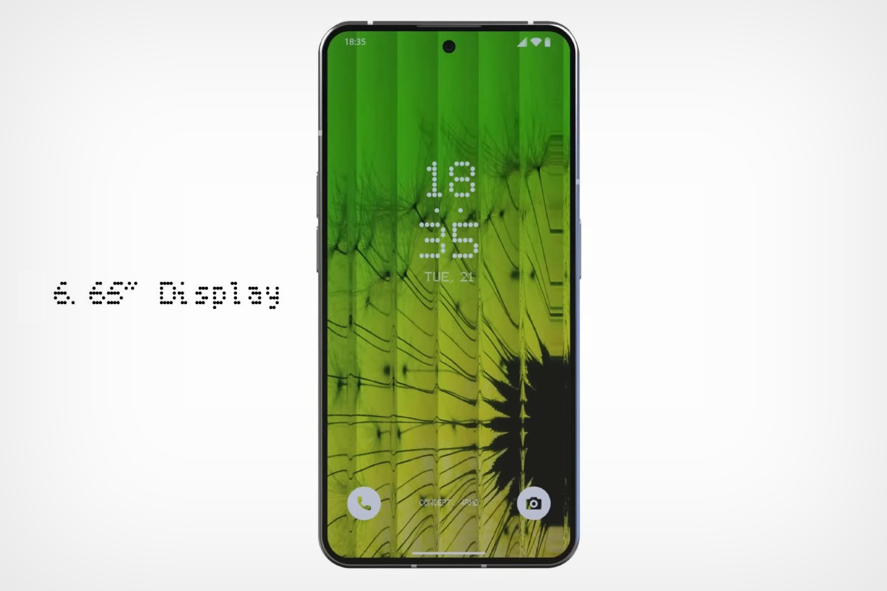
The launch date of the Phone (2) is unclear at this point, although judging solely by its predecessor, should happen sometime in the first half of this year with the phone being available for sale starting July 2023.
"interface" - Google News
March 28, 2023 at 06:30AM
https://ift.tt/F3KRfW2
Nothing Phone (2) concept renders show a new glyph interface centered around a 3-lens camera layout - Yanko Design
"interface" - Google News
https://ift.tt/WErhpDL
https://ift.tt/KXeQk1g
Bagikan Berita Ini


0 Response to "Nothing Phone (2) concept renders show a new glyph interface centered around a 3-lens camera layout - Yanko Design"
Post a Comment