If you’ve lived in a few places in your life then you probably have experienced the feeling of moving into a nice new apartment or house — a blank canvas of rooms and spaces filled with possibility. Most times, unless you’ve got that money money, you then fill it up with all of your same, old, dinged-up furniture.
I have had this experience a bunch over the years. When I moved out of my parent’s house, every single piece of furniture I had was thrifted, rescued or gifted. A mash-mash of centuries and styles that was well-lived-in the day I got it. Even as I got married and even moved, much of that same furniture came with.
Eventually, much of it began to feel too out of place and we passed it on and carefully bought or made things that we felt represented our home and resonated with us. But there is still that odd piece, like that dinged-up Dutch-modern coffee table, that we look at and remember the sticky cocktail clutter of karaoke nights in our 20s and the — still sticky — kid’s snacks of our 30s.
That’s where iPad is now. It’s a beautiful new monument to the engineering and hardware teams at Apple that continue to execute at an insane level year over year. But it’s filled with the still-functional-but-feeling-its-age iPadOS software. And it’s getting more out of place by the day.
This writeup has to be about what Apple has currently shipped, of course. That’s what consumers are getting in the mail when they order one now. But, Apple’s Worldwide Developer’s Conference is coming in just a couple of weeks and I hope to basically review this iPad Pro all over again in a new light.
Ironically, one of the biggest hardware upgrades for this model is going to elicit a relatively muted response in me here. The M1 chip is absolutely blistering. It delivers the same performance as the M1 MacBook Pro did in benchmark tests, making Apple’s lineup more a matter of form factor and use case than raw power. But last year’s model frankly still feels just as fast in almost all of the applications that I tested, and certainly in all of my daily workflows.
Yes, it’s super powerful and you’re getting the absolute latest in silicon, but upgraders won’t see any immediate difference. In some ways this is by design. In my interview last month with Apple’s John Ternus and Greg Joswiak about the iPad Pro they noted that the new unified processor strategy and the aggressively good display are about creating overhead that they hope developers will take advantage of.
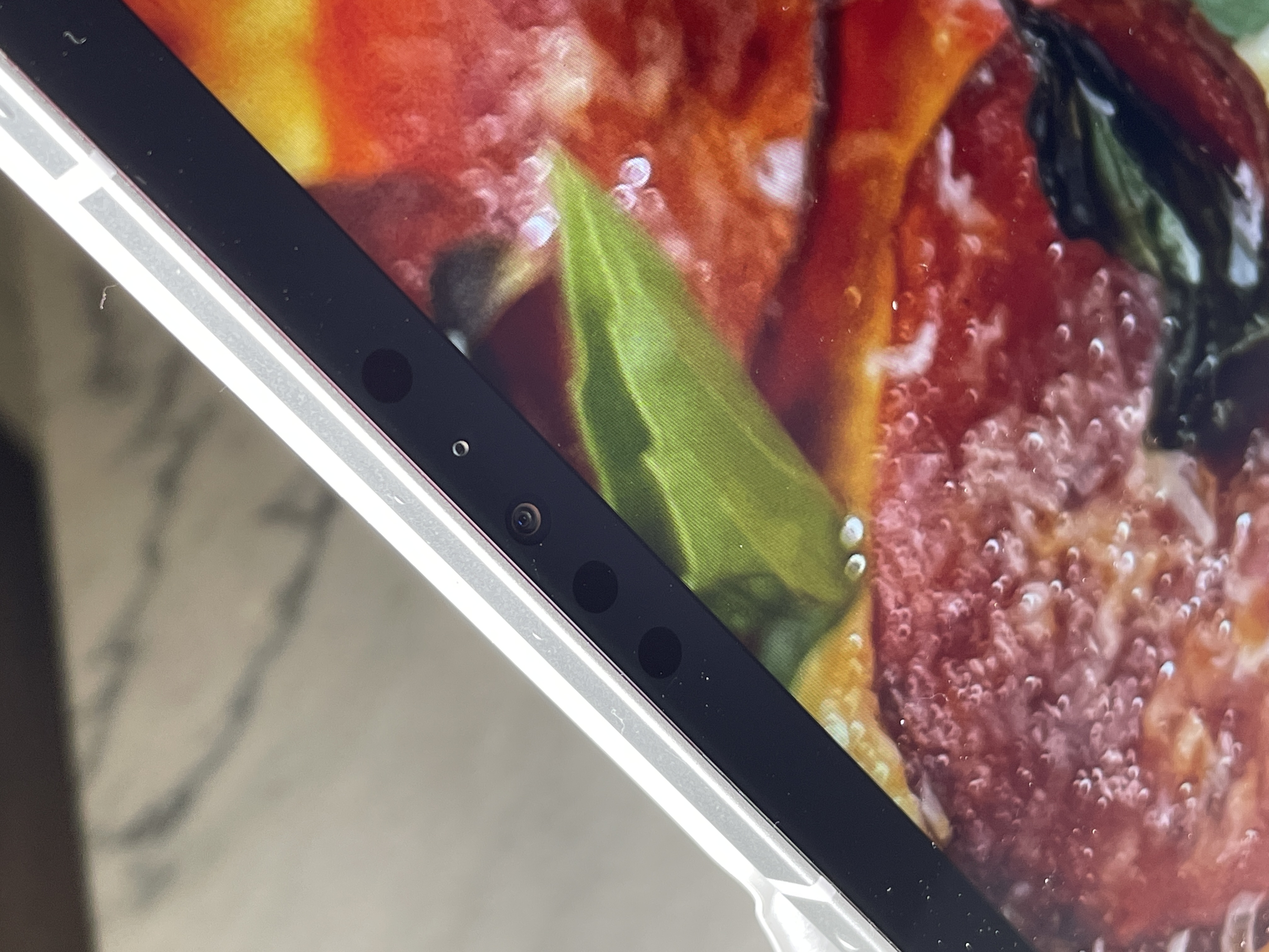
The new iPad Pro cameras are pretty fantastic, both front and back are now very usable and the new front camera especially benefits from an increase in resolution and new wide-angle optics. This wide angle makes video calling a bit more relaxed and doable on iPad Pro.
That is coupled with Center Stage, Apple’s new ML-driven feature that automatically crops and centers your head and shoulders, following you around with a smooth and forgiving pan and zoom as you lean, stand and even move about a room within the view of the camera. The feature works by using machine learning frameworks to detect a person’s silhouette within the frame and then applies “camera moves” to that view as you shift in the frame. Unlike some other auto-zooming features, Center Stage feels like there is a virtual camera operator there helping you to frame yourself properly. It’s really clever and very nicely done — and it’s one of the biggest upgrades to iPad Pro usability this time around.
And yes, if you’re wondering, this does a lot to mitigate the camera placement issues on iPad Pro. The camera remains in the “top center” of a vertically oriented iPad Pro, which means that it is on the “middle left” of a horizontally oriented keyboard-bound setup. This has led to an awkwardness in iPad video calling. Center Stage doesn’t completely delete these issues, hand placement is still a problem at times, but it goes a long way to making it more usable. The new APIs will make this feature available to all video calling apps by the way, and there are also some slight improvements in multi-tasking which let you use multi-pane setups without blanking out your video call in the process of a Zoom.
I tested the external Thunderbolt connection with Apple’s Pro Display XDR and it works fine. The displays are very close in capability so, aside from the scaling, this arrangement could prove to be very useful for pros working in a pipeline with XDR displays for color correction purposes. The software limitation of the iPad Pro only supporting mirror mode is still in effect, alas, which makes the usability of this feature a bit suspect in most situations.
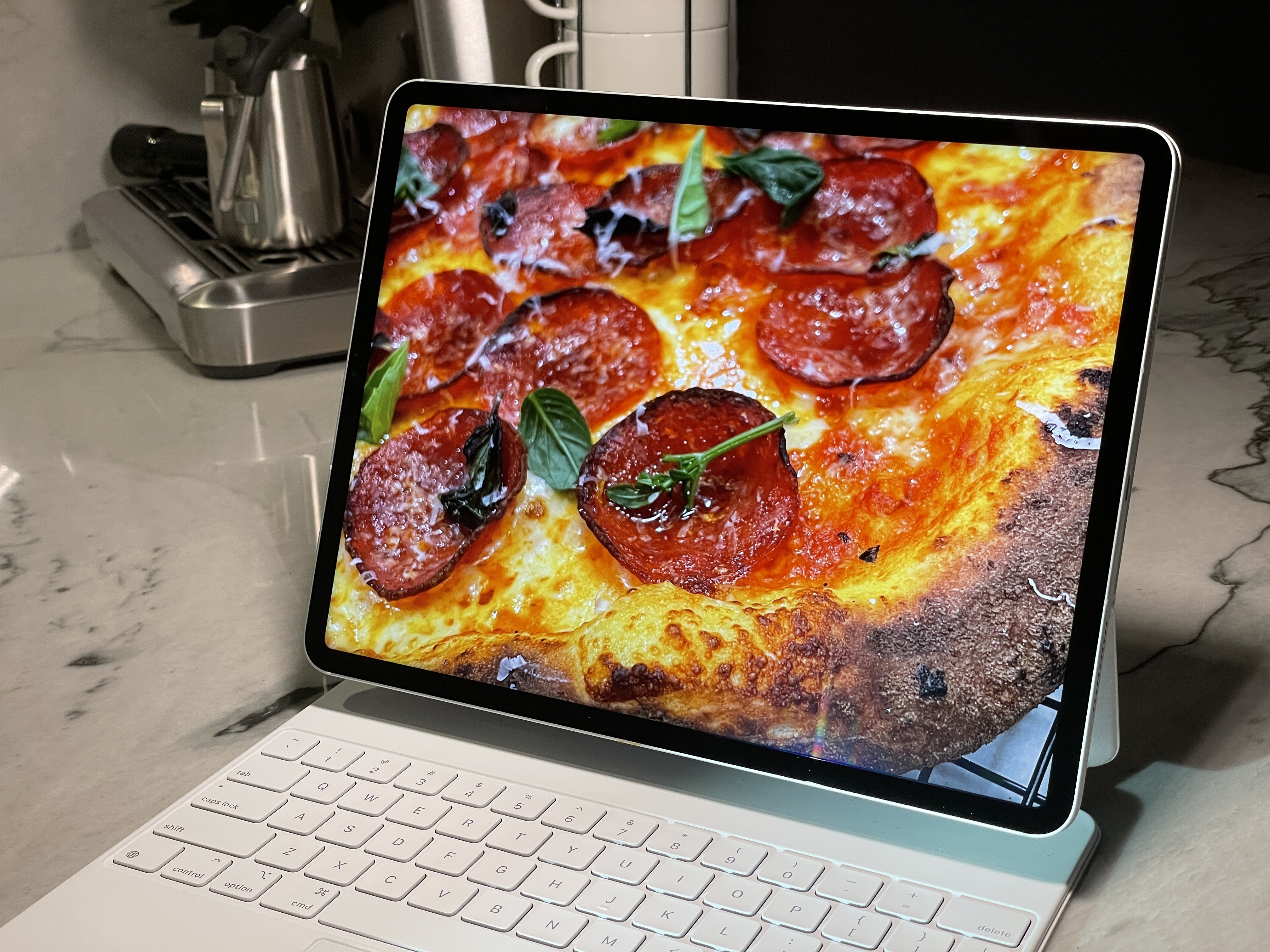
Speaking of the screen, the mini-LED-driven Liquid Retina XDR display is probably the best display that’s ever shipped on a mobile computer. It’s just fantastic. The daily driving brightness is good, with an average of 600 nit max, but full-screen HDR content like videos or photos allow the display to boom up to 1,000 nits average with a peak of 1,600 nits. This thing is b r i g h t. Daylight viewing of HDR content is massively improved. And this comes with inclusion of all the standard stuff, like the 120hz ProMotion features.
The 10,000 mini-LEDs in the display allow for much more precise localization of blacks (because they can turn off completely) and less bloom (though extreme tests still show it). They also provide a noticeably better edge-to-edge uniformity in brightness and improved off-axis viewing of content on the screen. It’s just better in every way. Absolute gold standard display here.
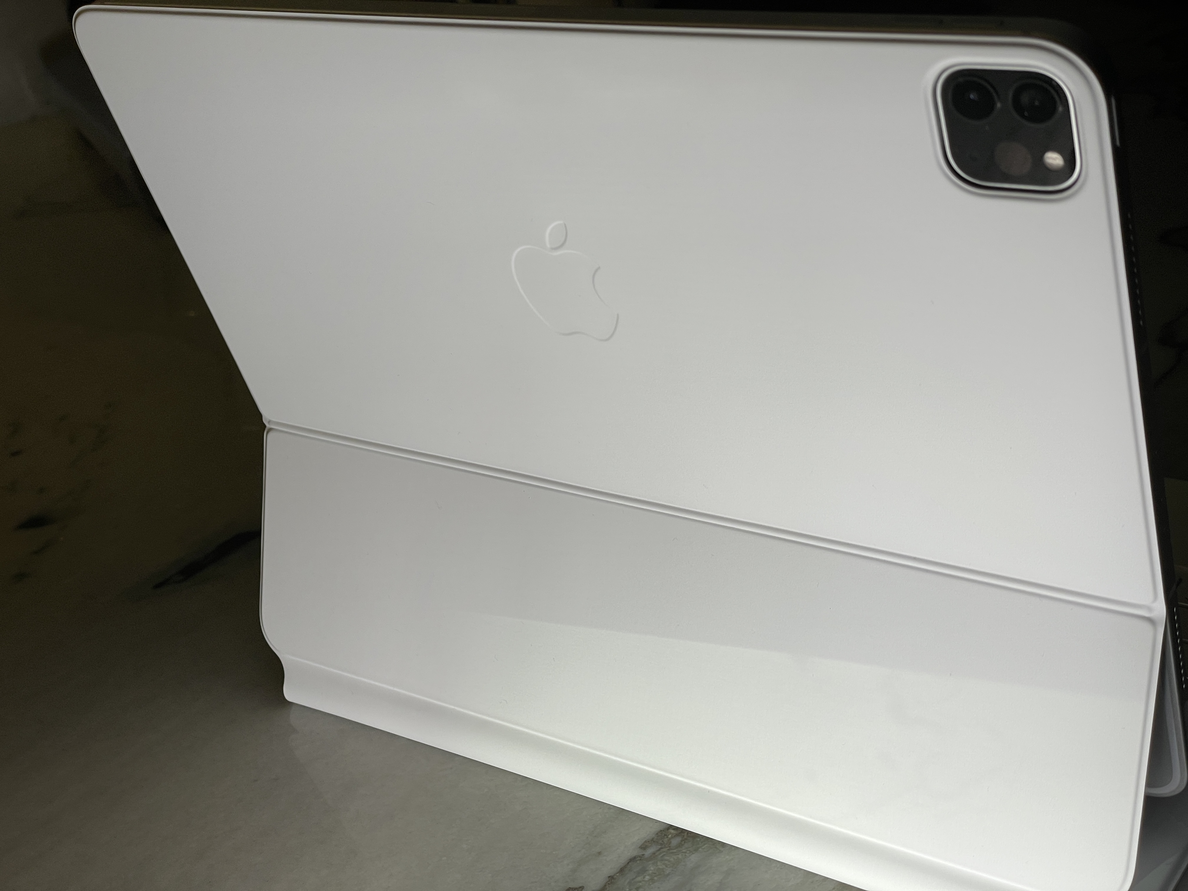
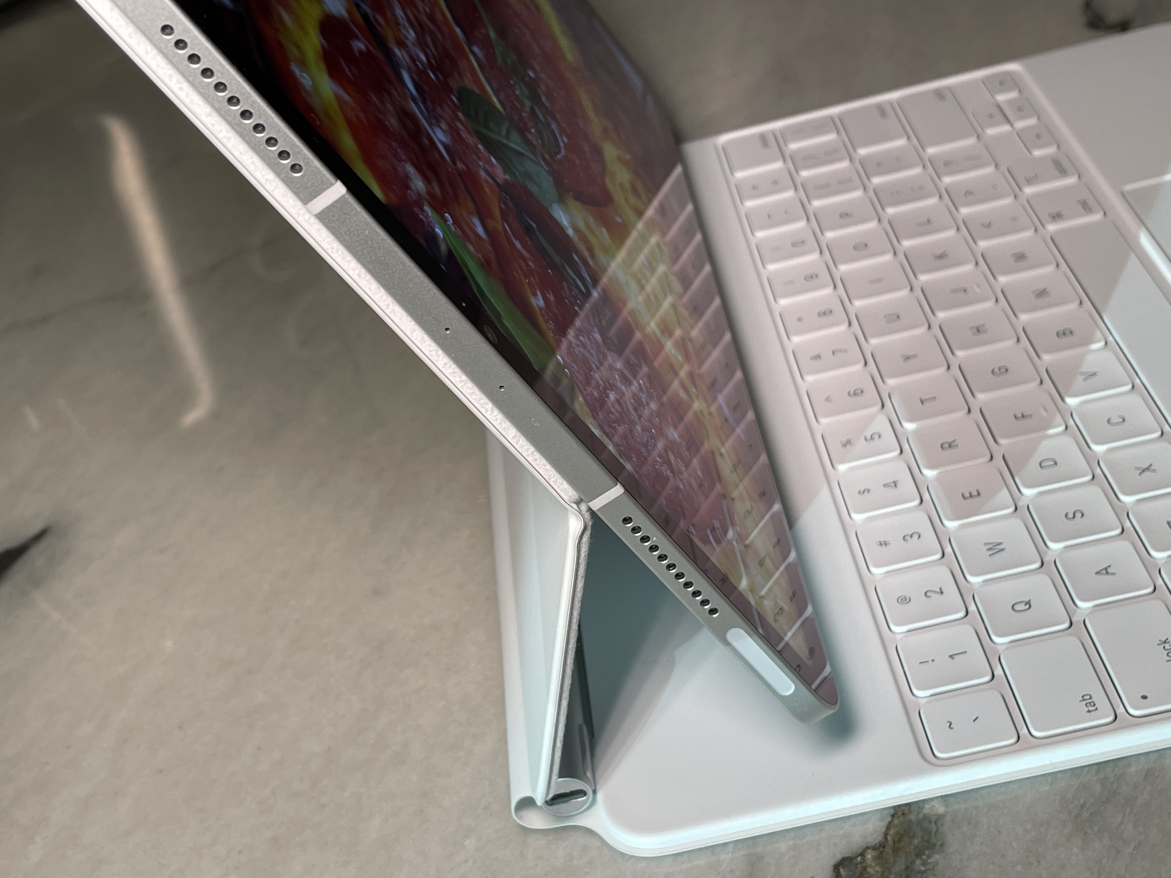
Apple’s new Magic Keyboard works essentially exactly the same as the previous version, but it now comes in white. I’m also happy to report that if you have an existing one it works completely fine on the new iPad Pro models. There was some minor uproar because Apple noted that the dimensions of the two devices were not the same so the old keyboard may not fit perfectly. Rest assured that it’s essentially the same exact fit and the functionality is identical. The only time any of it is evident is if you close it and peer very, very carefully at the open end you’ll notice that there is about 1mm less clearance between the rim of the case and the edge of the iPad Pro. Apple probably felt that it was better to over-disclose than anything here, but really, it’s not an issue.
The white color is fantastic-looking, especially with the silver model of iPad Pro and its white antenna window accents. It’s very 2001 (even though Kubrik’s iPads were black). I would fully, 100% expect this thing to get marred and dingy though. There’s a warning on the box that “color may transfer” and I would believe it. My demo unit has not sustained any noticeable markings yet but I would guess that it’s just a matter of time.
The overall feel of the keyboard is still great, a really nice typing experience and great little piece of kit that should be factored into the price of purchase of any iPad Pro because it’s just essential.
The other side of this coin that isn’t so shiny is the iPad’s aging software. It’s just as good as it was when I wrote my review of the iPad Pro in 2020 — at which point my conclusions were “you can adapt to it but it could be better.” That was a year ago. As someone who has used it as my only portable machine for the last two and a half years I can tell you that this is a very long time to wait for a big leap forward in capability.
I have a very simple ask for the iPad’s software. I want to feel the same energy vivacity and pure performance for the sake of peak performance that the hardware side exhibits.
Apple’s iPad Pro hardware is performing like an athlete in peak physical condition that is out three lengths ahead. The M1 chip and mini-LED display are really untouchable — it is exhilarating to see this much excellence packed into one device.
Unfortunately the software can not cash those checks, leaving this iPad Pro to feel like a perfect house with the same old furniture.
Apple has done an incontestably incredible job with the 2021 iPad Pro’s hardware, but it needs to level up the software. As a “power” user that lives on iPad Pro much of the year, I have grown used to my kludges and tic-affordances. But there needs to be some big-time commitment to the iPad paradigm here. The pane-style interface currently has so many things to recommend it as a brutally fast, fluid way to work, but there is no follow-through. There is no willingness to say “this is a new way of working and you will learn it.”
Too much of the iPad Pro’s current software leans into “affordance valley.” A place where users are still treated as if they aren’t capable of learning a touch-first way of working. Instead, these affordances actually do the opposite and stand in the way of progress.
This reminds me of the “reduce animations” affordance circa the iOS 7 era. When Apple reinvented iOS it went way overboard in animations in order to make it super clear to the user what was happening when they were tapping around the new pane-based interface. Nothing was “slower” hardware-wise but the animated affordances they put in were tuned too far up and made it feel slower. Turning those animations off made the interface feel snappier and more useful almost instantly.
Apple eventually got those animations under control by conceding that maybe people were indeed ready to be more advanced touch users.
This is where the iPad Pro is currently and it’s the disparity that irks the most. This is one of the best computing hardware devices ever made, and you know it’s capable of so much more than it is currently being let to do. Apple has always had an editorial point of view when it comes to software and I can appreciate that. But currently, it feels like that stance is far too conservative when it comes to iPad Pro.
That’s why I’m waiting for WWDC with bated breath. With this much high-level execution on the hardware side, you have to imagine that the time is ripe for Apple to really take the next leap forward with iPad software. When that happens and we get a solid view of Apple’s vision for the next wave of iPad work, I’ll come back to the table with another look.
"again" - Google News
May 19, 2021 at 09:20PM
https://ift.tt/3hCxOTf
Review: Apple’s 2021 iPad Pro is great, again, but… - TechCrunch
"again" - Google News
https://ift.tt/2YsuQr6
https://ift.tt/2KUD1V2
Bagikan Berita Ini


0 Response to "Review: Apple’s 2021 iPad Pro is great, again, but… - TechCrunch"
Post a Comment