nothing Phone (2): Design Shapes Future of Mobile Technology
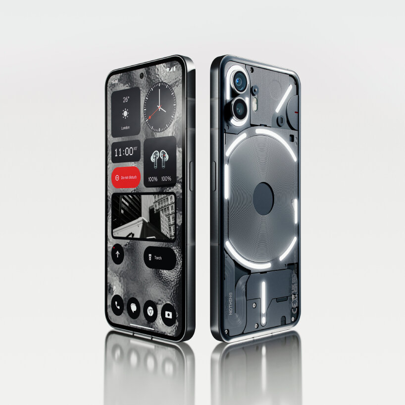
embrace the craving for more me-time and less screen time with the Nothing Phone (2). Its refreshed Glyph Interface, on the exposed, machinery-styled rear, flashes whenever the user receives a notification. This enables the user to minimize checking their smartphone screens every time by triggering a light strip that corresponds to a certain notification. It revolutionizes the smartphone experience as the ultimate digital detox solution.

Nothing Phone (2) officially launched on July 11th, 2023
all images courtesy of Nothing
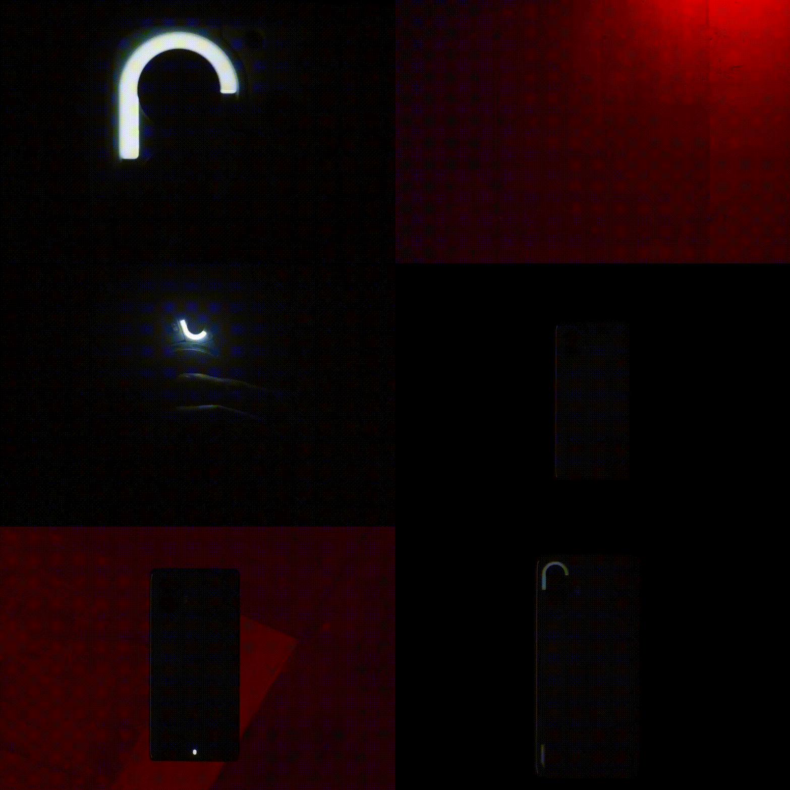
There is a fun part in the new Glyph interface: the user can create their own flashing light sequence per contact and app, letting them make their rhythmic light flashes for a specific person and function. The new Glyph interface enables specific ringtones to be composed too. Under sound settings, a series of pads – similar to a sampler machine used by DJs and music producers – can be tapped to trigger different light strips at the rear of the phone. After composing the sound combinations for their own Glyph Ringtone, Nothing Phone (2)’s rear flickers whenever they receive a phone call or notification.

Nothing Phone (2) comes with flashing light strips that users can customize
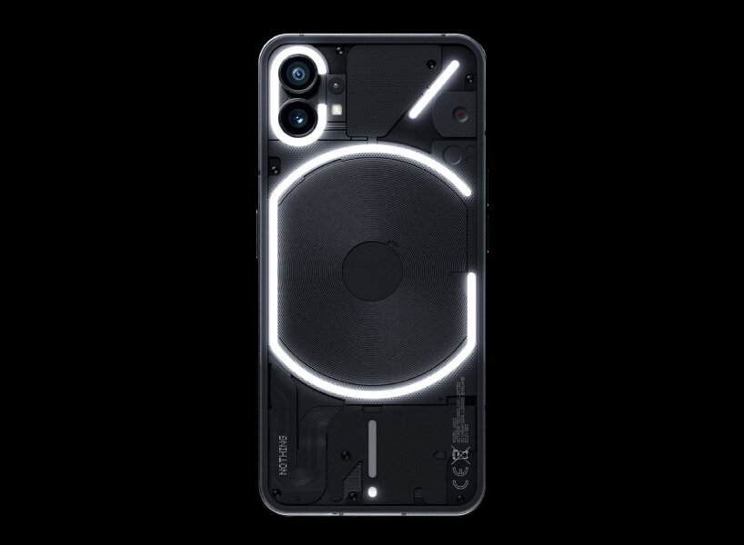
Nothing Phone (2) takes design cues from the manufacturer’s predecessor, Phone (1), but this time, the LED light strips are interrupted to lend a sense of an edgier style with a more synthesizing effect. Encased within the middle ring lights, visible lines reverberate from inside out, mimicking the lines of fingers. The thinner midframe improves the phone grip with its rubber-like material, a way to avoid accidental dropping or slipping.

the lines of the new phone are interrupted compared to its predecessor
Pushing Boundaries: Elegance and Innovation of Phone (2)
The rear also looks exposed, as the transparent glass casing unobtrusively lets viewers see its inside. Nothing Phone (2) displays enhanced aesthetics with its harmonized and symmetrical design, whose shapes, colors, positioning, and texture of each component bring out a distinctive modern look. Glancing at the top right, the two cameras woo quality-photo enthusiasts with their advanced 50-megapixel sensors that can take videos in 4K resolution at 60fps. Thanks to its higher-bit image signal processor, Nothing Phone (2) can process camera data up to 4,000 times more than its predecessor, enabling its algorithms to generate clear and sharpened images.
"interface" - Google News
August 07, 2023 at 03:33PM
https://ift.tt/S67EjCx
nothing phone (2) shows machinery and adaptable glyph interface - Designboom
"interface" - Google News
https://ift.tt/dilBA7T
https://ift.tt/WOiTDco
Bagikan Berita Ini


0 Response to "nothing phone (2) shows machinery and adaptable glyph interface - Designboom"
Post a Comment