Peloton has implemented a number of minor user interface changes across multiple platforms.
First, there is a new text font on both the web browser and hardware devices.

The font is slightly narrower and more condensed than the previous font utilized.

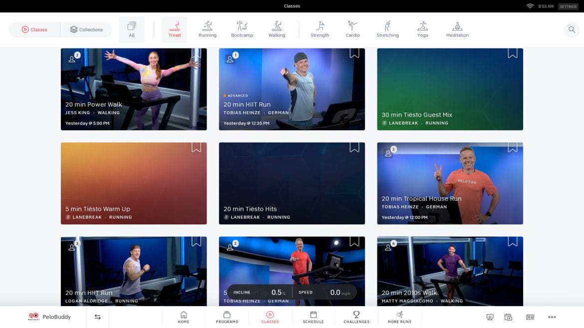
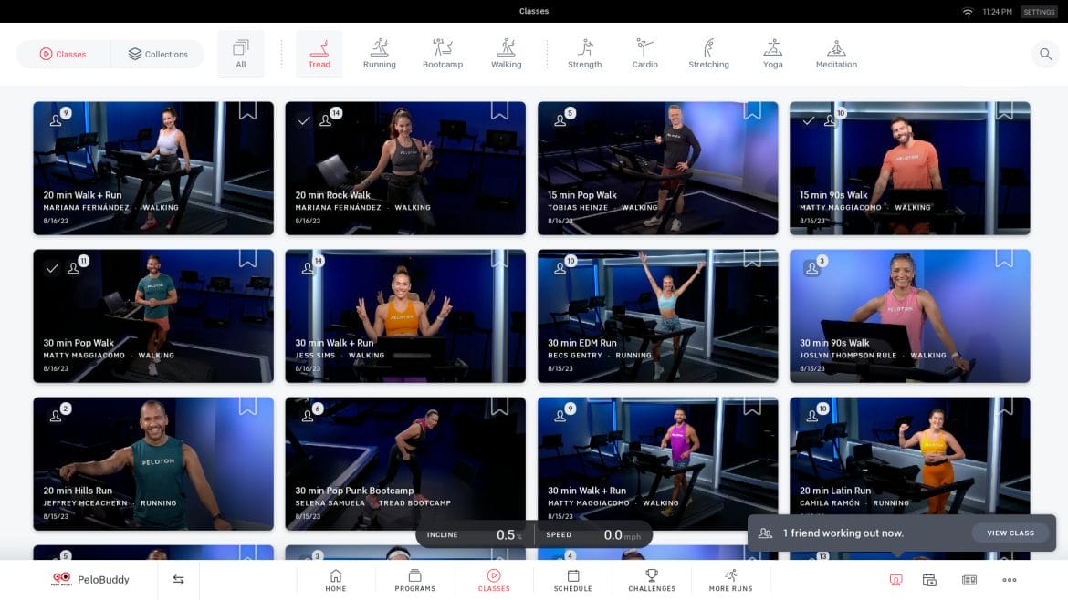
Next, on Bike, Tread, and Row devices the grid of classes has increased from three to four classes displayed across the screen.

This is allowing a higher number of classes to be displayed on the tablet at any given time.

In addition, the classes are no longer displaying the exact time the class was released – only the date. Furthermore, whereas previously the most recent classes would display a notation of “today” or “yesterday,” now only the date is listed, even if it is the current date.
As of publishing time both the web browser and App are displaying the class date and time as they have previously.
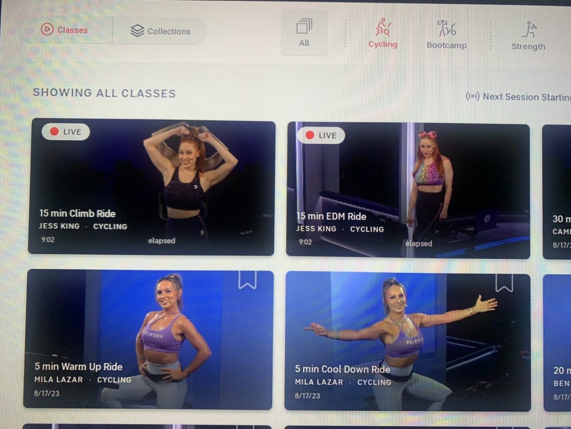
Lastly, members have noticed a “live” icon displaying on some of the most recent classes. For example, at 9:00 a.m. ET on August 17, a “live” icon was shown on two Jess King rides that were dropped straight to the on demand library.

It is currently unclear what exactly this “live” icon means. At first glance, one might think that the icon indicates an on-demand class that is currently encoring. However, these particular classes were not scheduled to encore until later in the morning.
It could be a new feature that displays live classes in the on-demand library so that it is more noticeable to members (as opposed to being displayed solely on the home screen or in the upcoming schedule) that a live class is currently occurring. Lanebreak classes recently began appearing in the full class library, presumably to provide more easy access and serve as a reminder that they are available. Yet, live classes typically do not become available in the on-demand library until at least one hour after they end, suggesting that perhaps the class will disappear after it airs live until it is fully available.
It could also be some kind of bug that has accompanied the change in formatting. The Jess King rides were released at 9:00am ET and were 15 minutes in length, so the system could feasibly think that the classes were occurring at that moment. We will share updates on this change in particular as the details become more clear.
What do you think of these user interface changes Peloton has recently implemented?
Want to be sure to never miss any Peloton news? Sign up for our newsletter and get all the latest Peloton updates & Peloton rumors sent directly to your inbox.
"interface" - Google News
August 18, 2023 at 06:11AM
https://ift.tt/RaT2xmL
Peloton Makes Small User Interface Changes - New Font, 4 Classes Displayed Per Row on Bike/Tread/Row, & New ... - Pelo Buddy
"interface" - Google News
https://ift.tt/SXOwpJu
https://ift.tt/M71ilQB
Bagikan Berita Ini


0 Response to "Peloton Makes Small User Interface Changes - New Font, 4 Classes Displayed Per Row on Bike/Tread/Row, & New ... - Pelo Buddy"
Post a Comment