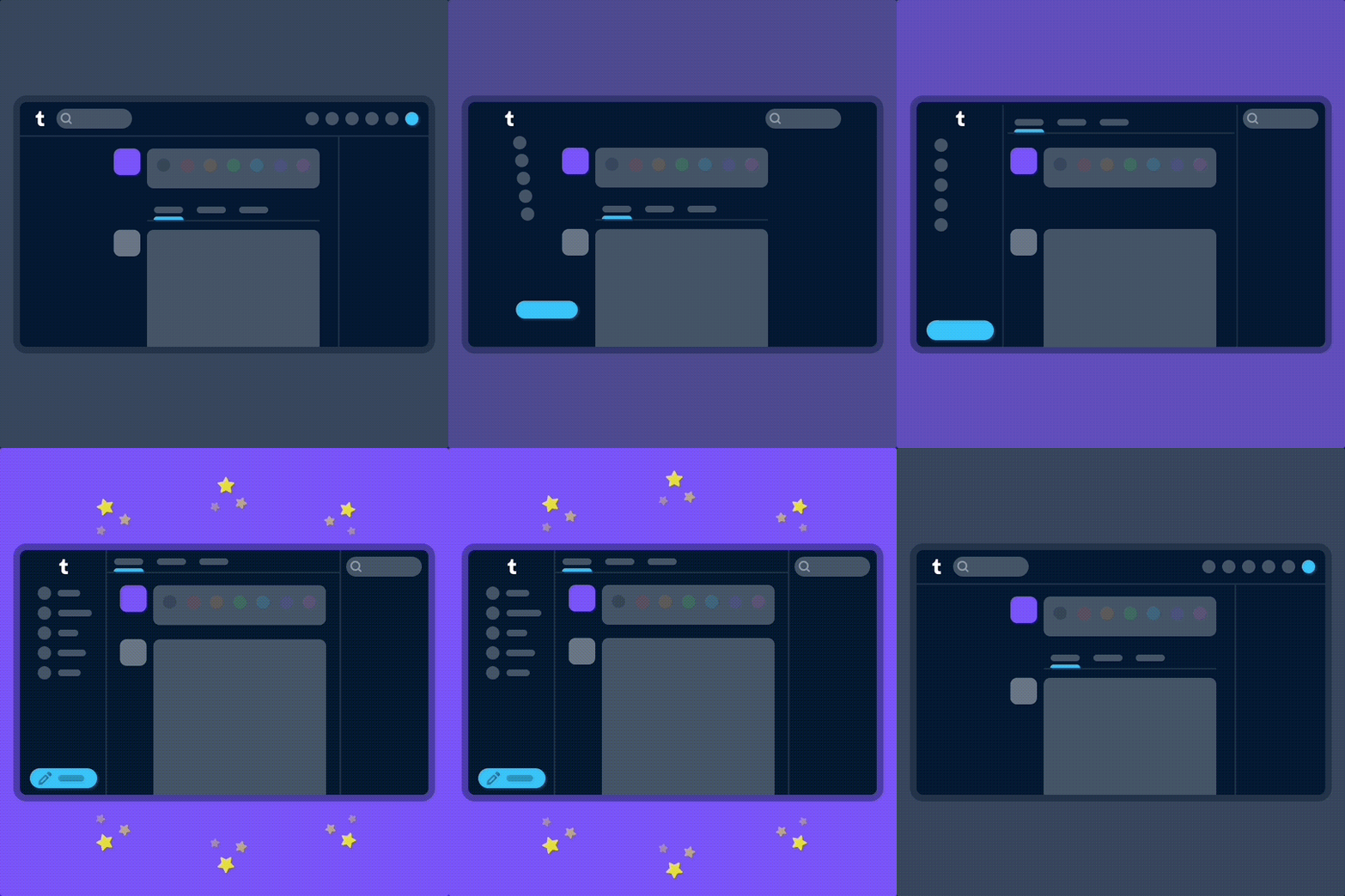
Tumblr is officially rolling out a new look for its web browser after testing it with select users over the past month. The new navigation interface looks a lot like X, formerly known as Twitter, as it brings the platform’s navigation bar to the left. The new look also brings the compose button to the bottom left of the screen, which is where the compose button is located on X.
The company says it made the change to make it as easy as possible for everyone to understand and explore what’s happening on Tumblr, whether they’re new to the platform or existing users.

Image Credits: Tumblr
“When adding something new to Tumblr in the past, we’d simply add a new icon to our navigation with little further explanation,” Tumblr wrote in a blog post. “Turns out no one likes to press a button when they don’t know what it does. So now, where there’s space, the navigation includes text labels. Since adding these, we’ve noticed more of you venturing to previously unexplored corners of Tumblr.”
Tumblr says it has incorporated feedback from users during the testing phase and already introduced some tweaks for the new look. These changes include returning settings subpages (Account, Dashboard, etc.) to the right of the settings page instead of having them in an expandable item in the navigation on the left, fixing some issues with messaging windows on smaller screens, and streamlining the Account section to make it easier to get to your blogs.
The platform is looking into making a collapsible version of this navigation and improving the use of screen space for users who have larger screens. The company says it’s also working on improving access to accounts and sideblogs.
Tumblr saw an uptick in new users after Elon Musk took the reins of Twitter (Now X) last November, as users were looking for an alternative. At the time, Tumblr CEO Matt Mullenweg reported a 58% increase in iOS app downloads and a 57% increase for Android users in the first week of November.
According to data that TechCrunch viewed from data.ai at the time, Tumblr gained 880,000 new installs across iOS and Android in November, up from 450,000 and 500,000 in September and October, respectively. But in the following months, its download numbers returned to standard levels (around 400,000 to 500,000 downloads per month).
Since people are still looking for an alternative to Twitter, Tumblr may be looking to attract new users by making its platform look more like X. Obviously, many Tumblr users aren’t fond of the new change, and they have taken to X to express their displeasure with the change.
The changes come a few weeks after Mullenweg revealed that Tumblr is spending about $30 million more than it makes each year. This isn’t too surprising, given Tumblr’s history. The company was founded in 2007 and acquired by TechCrunch parent company Yahoo for $1 billion in 2013. But by 2019, WordPress.com parent Automattic bought Tumblr for just $3 million.
Although Tumblr has a loyal base of users, the platform has struggled to grow its daily active users since its infamous porn ban. But, the users it does have are extremely protective of the site’s culture, so modifications, even somewhat small ones, can be seen as unwelcome changes.
"interface" - Google News
August 18, 2023 at 02:49AM
https://ift.tt/VHYPtGl
Tumblr is rolling out a new web interface, and it looks a lot like X (formerly Twitter) - TechCrunch
"interface" - Google News
https://ift.tt/E8R5u6C
https://ift.tt/CdmhOXH
Bagikan Berita Ini


0 Response to "Tumblr is rolling out a new web interface, and it looks a lot like X (formerly Twitter) - TechCrunch"
Post a Comment