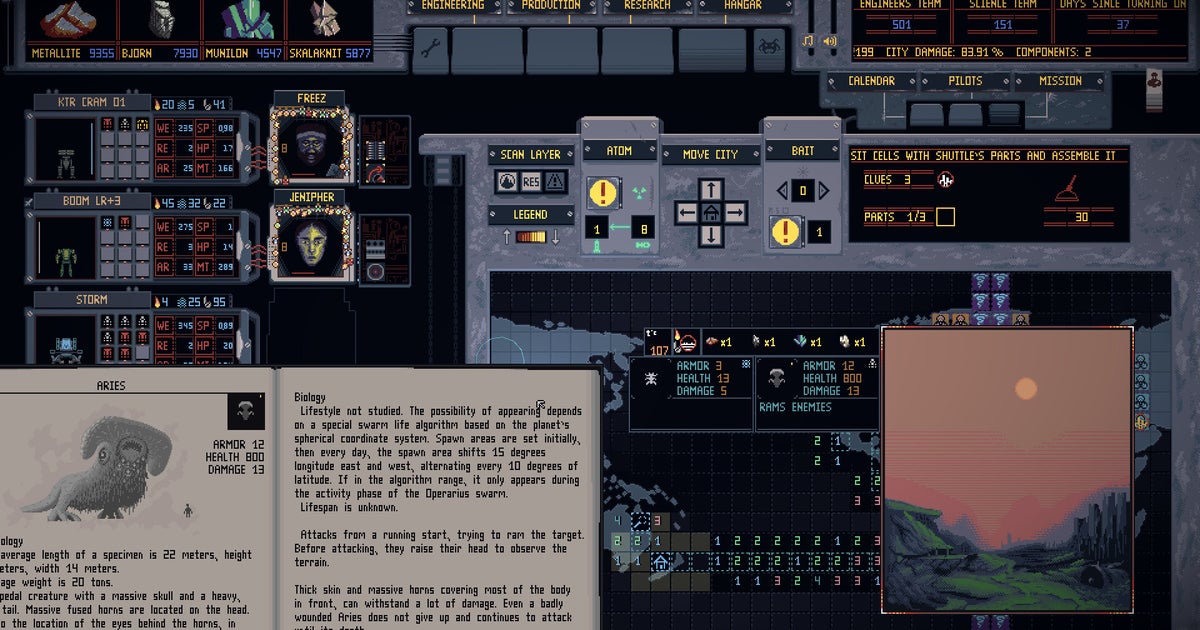
If you heard loud swearing last night in the Watford area it may have been one of two things: 1) me cussing out my (borrowed) Steam Deck while stealthily accessing the wifi from outside a closed public library, as I don't currently have broadband at home, or 2) me subsequently trying to make head or tail of Mech Engineer, in which you take charge of a mobile undersea metropolis and send squads of painstakingly assembled robosoldiers to semi-auto-battle squidgy alien fauna.
Engineering a mech is a Herculean labour whose completion eludes today's puny scientists, and Mech Engineer doesn't aim to make life easier, whatever its putative status as a "means of fun". Mech Engineer is a game with an attitude problem, frankly. I realised this on in-game day two, when the interface coughed up a bunch of damage reports presented as pieces of paper, which I then had to crumple up and toss away individually.
That interface! There's an innocent 30 seconds initially when you think it's just badly designed. But then you realise that it is a creature of foul and labyrinthine purpose. Broadly, it consists of a Dwarf Fortressy grid-based world map, where you can shunt your city about and send mech squads on missions, with tabs for researching new components, fabricating them, and assembling them into conveniently coffin-sized Gundams you can then fill with pilots. There's a calendar which lets you advance to the next day. Reading those sentences back, it sounds practically transparent. Like XCOM but with extra robots, right? Wrong! Mech Engineer is nothing like XCOM. It is like tying your shoelaces with a pair of scissors. It is like doing jigsaw puzzles in a cesspit after the death of the sun.
When I mentioned Mech Engineer to Graham he said it reminded him of MicroProse's older interface 'em ups, in which the thrill arises from the quasi-analog, high-fidelity obfuscatoriness of the simulation itself. I subsequently went away and discovered that yes, MicroProse is Mech Engineer's publisher. I do not have the benefit of Graham's greatly advanced years and accompanying experience of recreational inconvenience, but to me Mech Engineer feels almost like a parody of MicroProse's games on par with Space Warlord Organ Trading Simulator.
The interface is a sour quagmire of vexing dials, submarine-style viewports, wireframe graphs and incomprehensible LED readouts, laid out in violent contradiction of present day notions of "flow", with several ways of flipping between screens that compete for your attention constantly, on-screen buttons in place of keyboard controls, a habit of miniaturising the most important elements, and a relentless desire to overcomplicate every little interaction. Again, you might think it to be poorly made, but it's very obviously a labour of love. Each individual fitting has a just-so exactness, from the monochrome firing range simulator through the authentically papery bestiary and landscape illustrations, to the sheer range of alarm SFX and mechanical reports that blare from the guts of the beast as you tootle about pressing the wrong bits and getting your pilots slaughtered.
The actual mech engineering is in-depth and seems engrossing. For instance: you have to construct, test and ignite a mech's reactor before slotting it into the chassis, which feels vaguely cathartic - like putting the cherry on a carefully optimised cake's worth of delicately thinned-out armour plating, optional energy shields, and chonky Gatling guns that can themselves be tweaked and whittled to satisfaction. Battle, meanwhile, is fairly hands-off and visually reminiscent of Duskers: you give your squad waypoints and fiddle with things like spacing while they shoot at Space Invaders in real-time on a scratchy radar display, until they run out of ammo or crumple under the stress.
Your pilots have animated portraits, and my word, they are an unsightly bunch even before you feed them to the extra-terrestrials - not so much an army of Doomguys as a cluster of chatbot gargoyles gawping at you from the abyss. Again, there's a just-so feel to it all that hooks my curiosity even as I whinny in anguish, uninstall the demo in a frenzy, and race back to the library at midnight to download something gentler, like Tiny Glade. Mech Engineer! How I loathe you, especially as I've just realised that Sin wrote you up three years ago - honestly, it sounds like the only thing that has really changed in the meantime is that you can now buy the full thing on Steam.
"interface" - Google News
June 04, 2024 at 07:17PM
https://ift.tt/zk7CXej
Mech Engineer's demo is for people who love hateful interface design - Rock Paper Shotgun
"interface" - Google News
https://ift.tt/c4CURDr
https://ift.tt/TcN5l3x
Bagikan Berita Ini


0 Response to "Mech Engineer's demo is for people who love hateful interface design - Rock Paper Shotgun"
Post a Comment